Coverage X
Brand Identity / Visual System
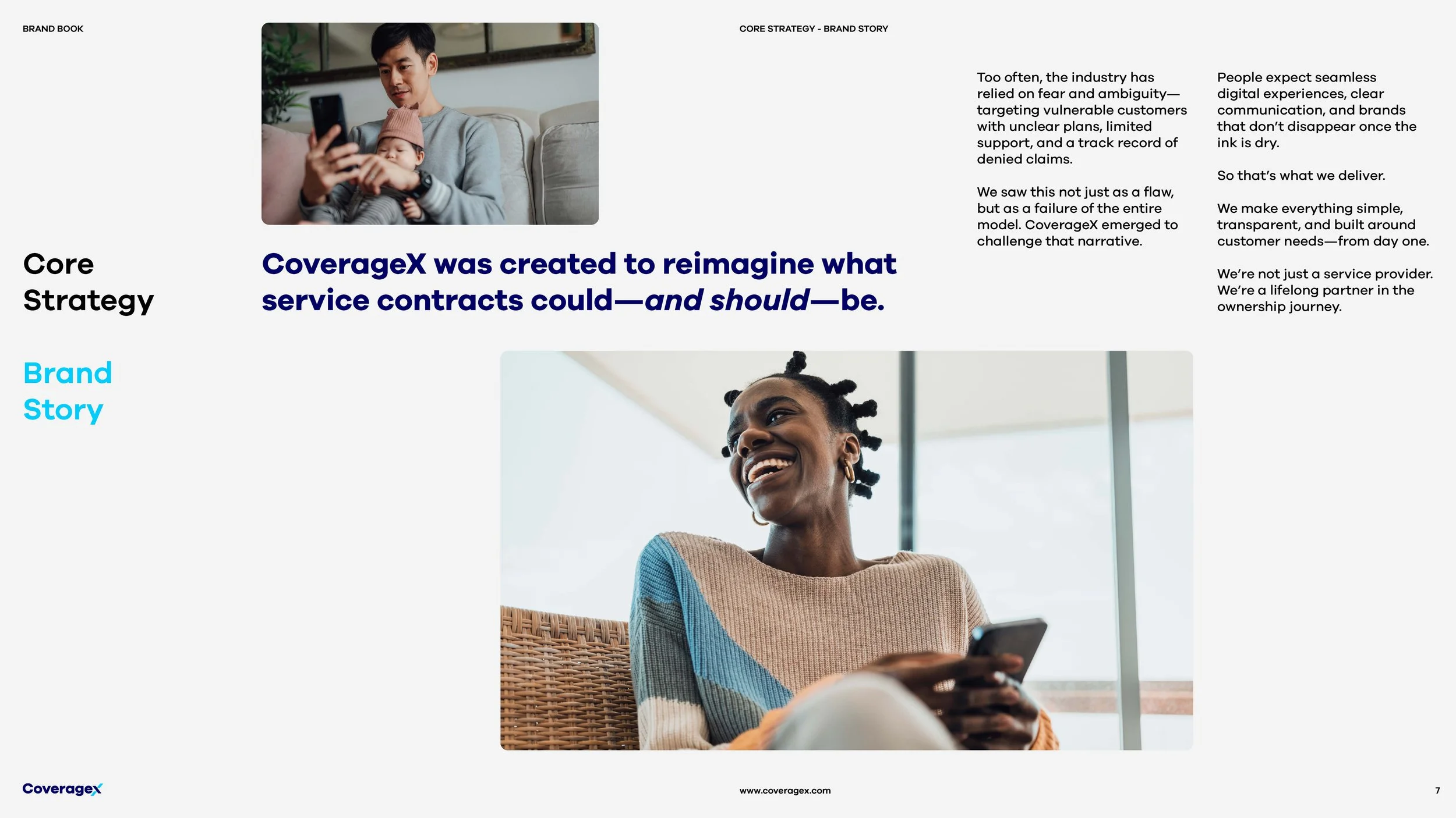
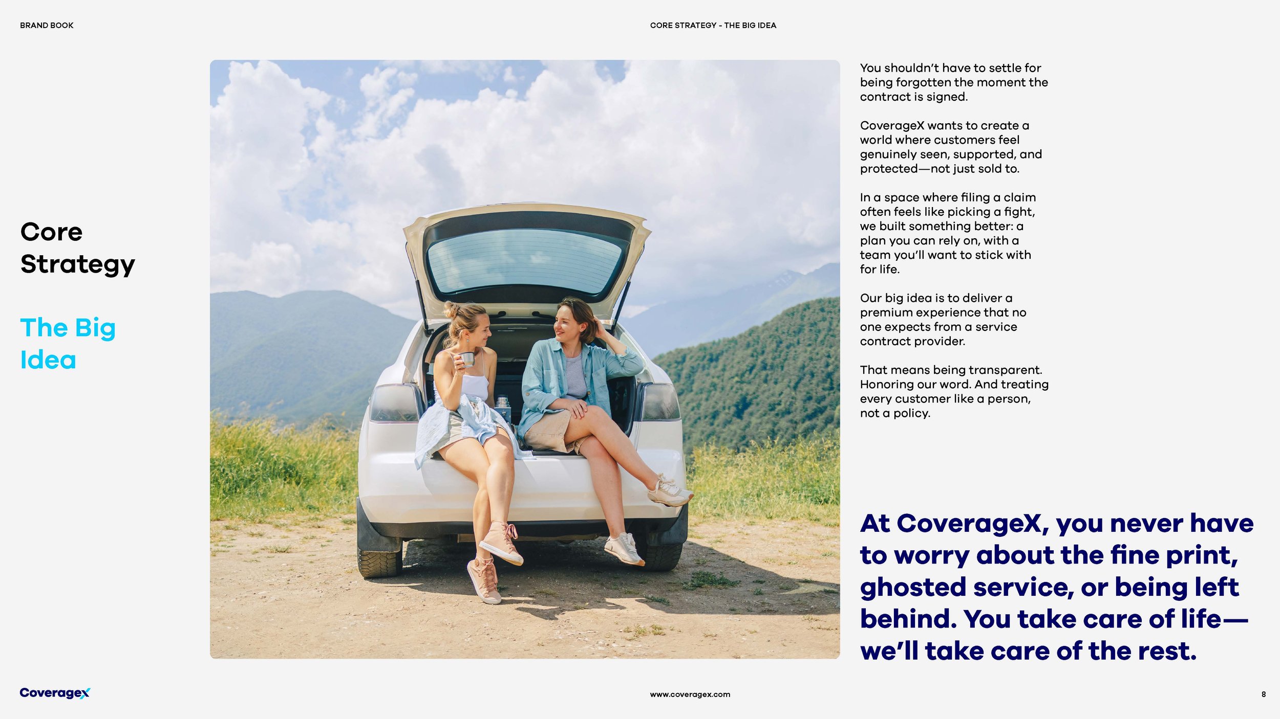
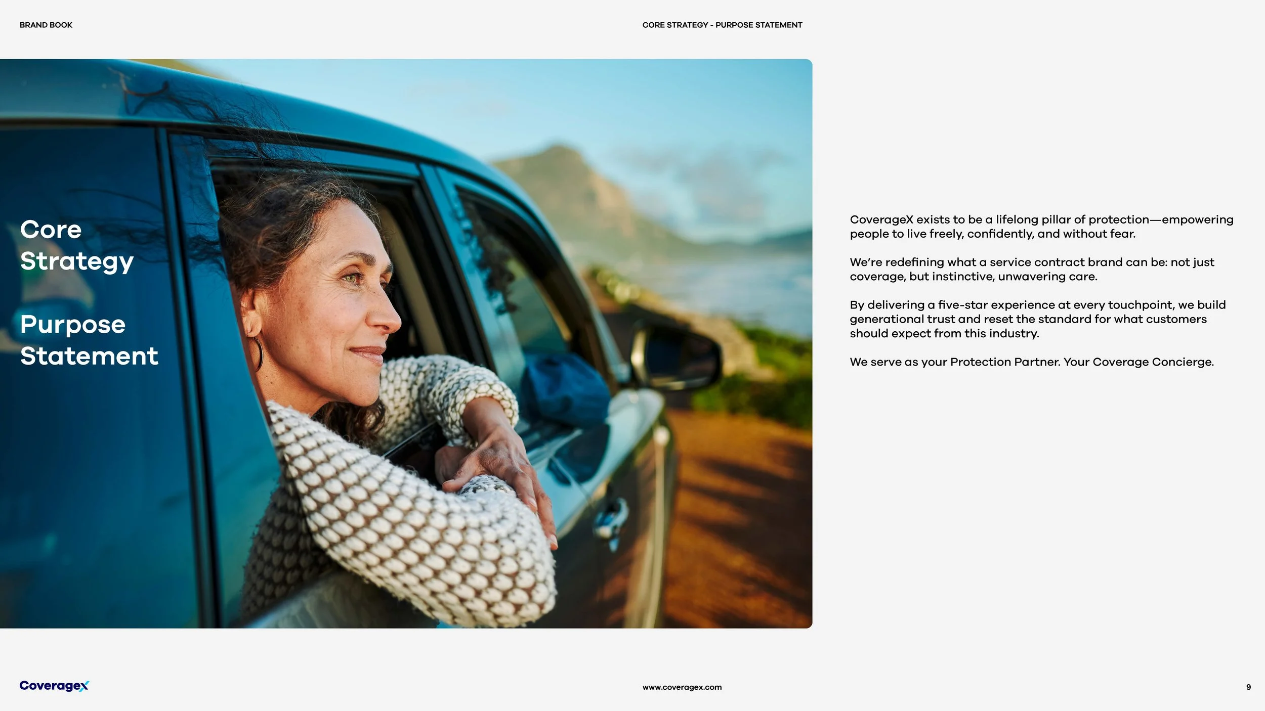
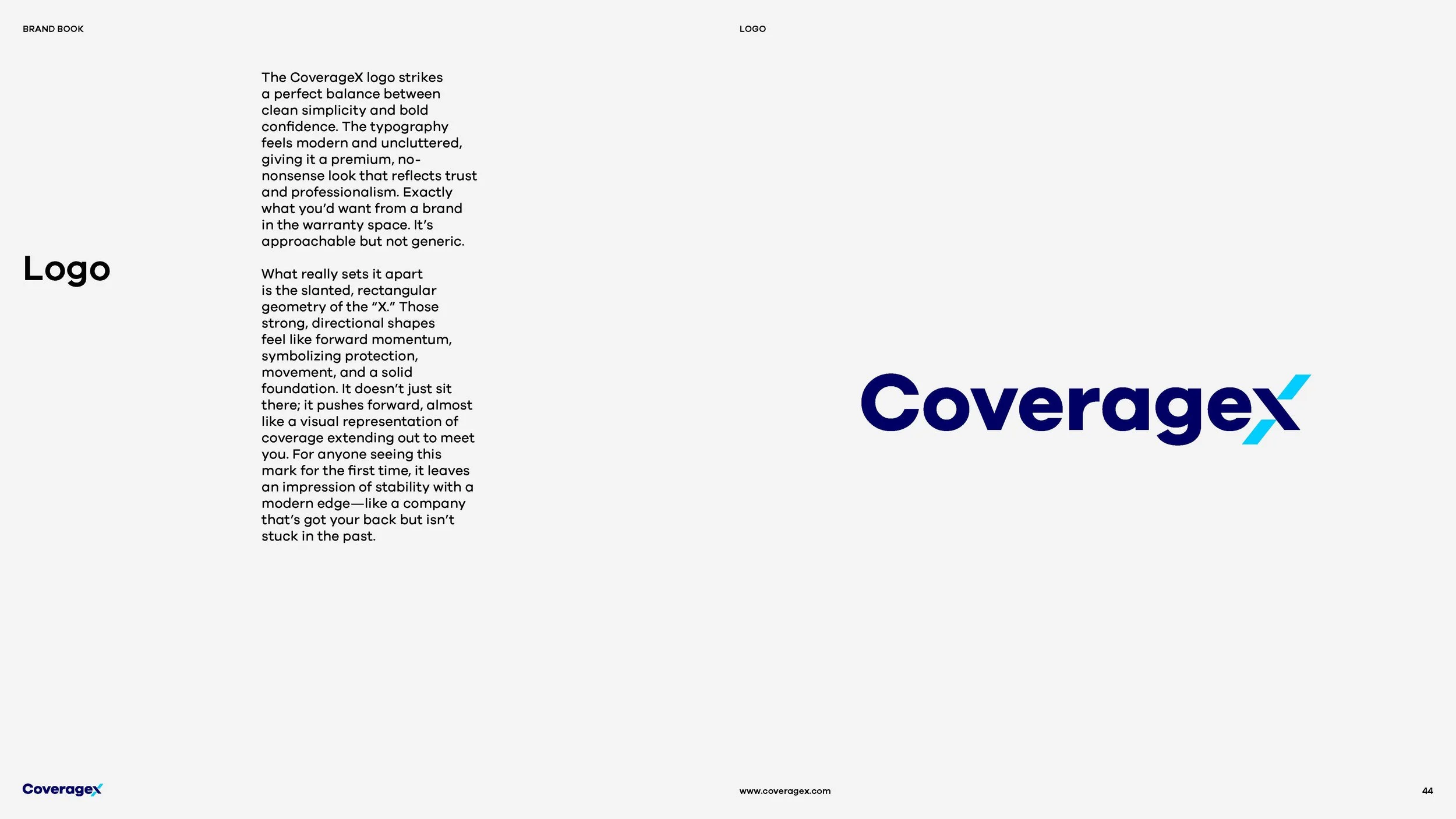
CoverageX set out to challenge an industry traditionally defined by fine print, complexity, and a lack of trust. The opportunity was to create an identity that felt less like a conventional warranty provider and more like a modern, premium protection partner. I designed a new logo and visual identity built around a simple but powerful idea: the X.
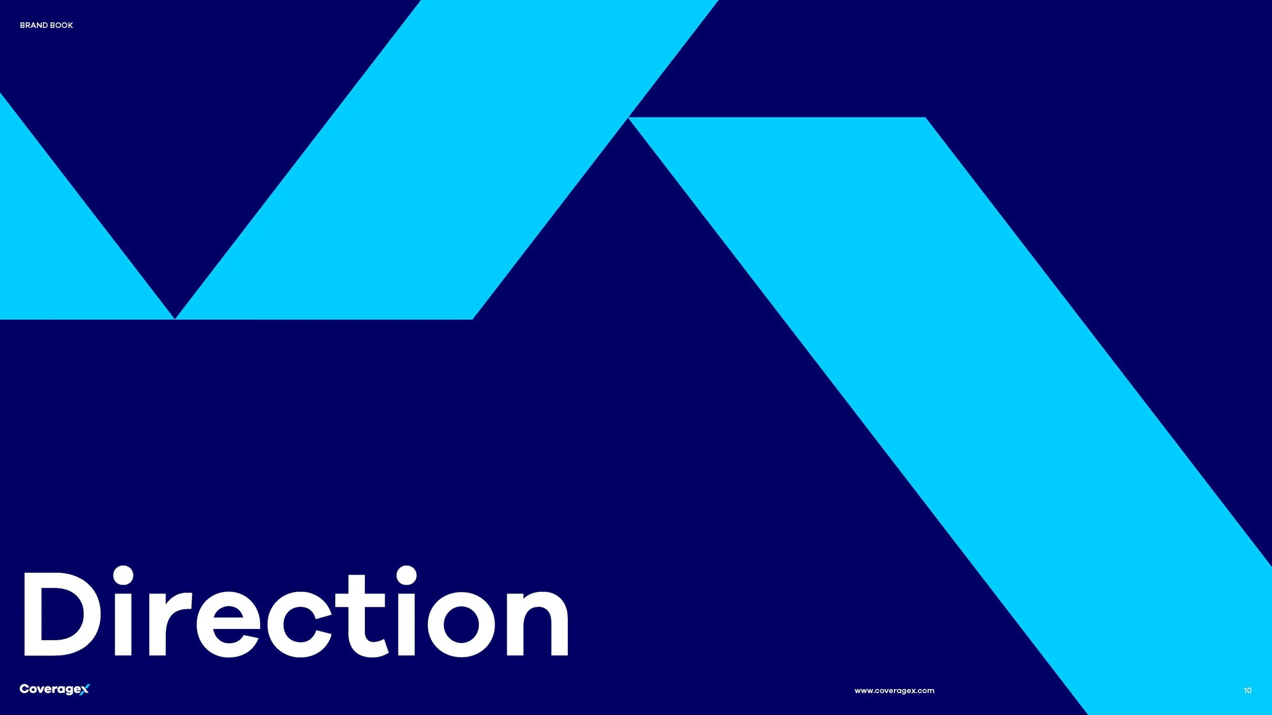
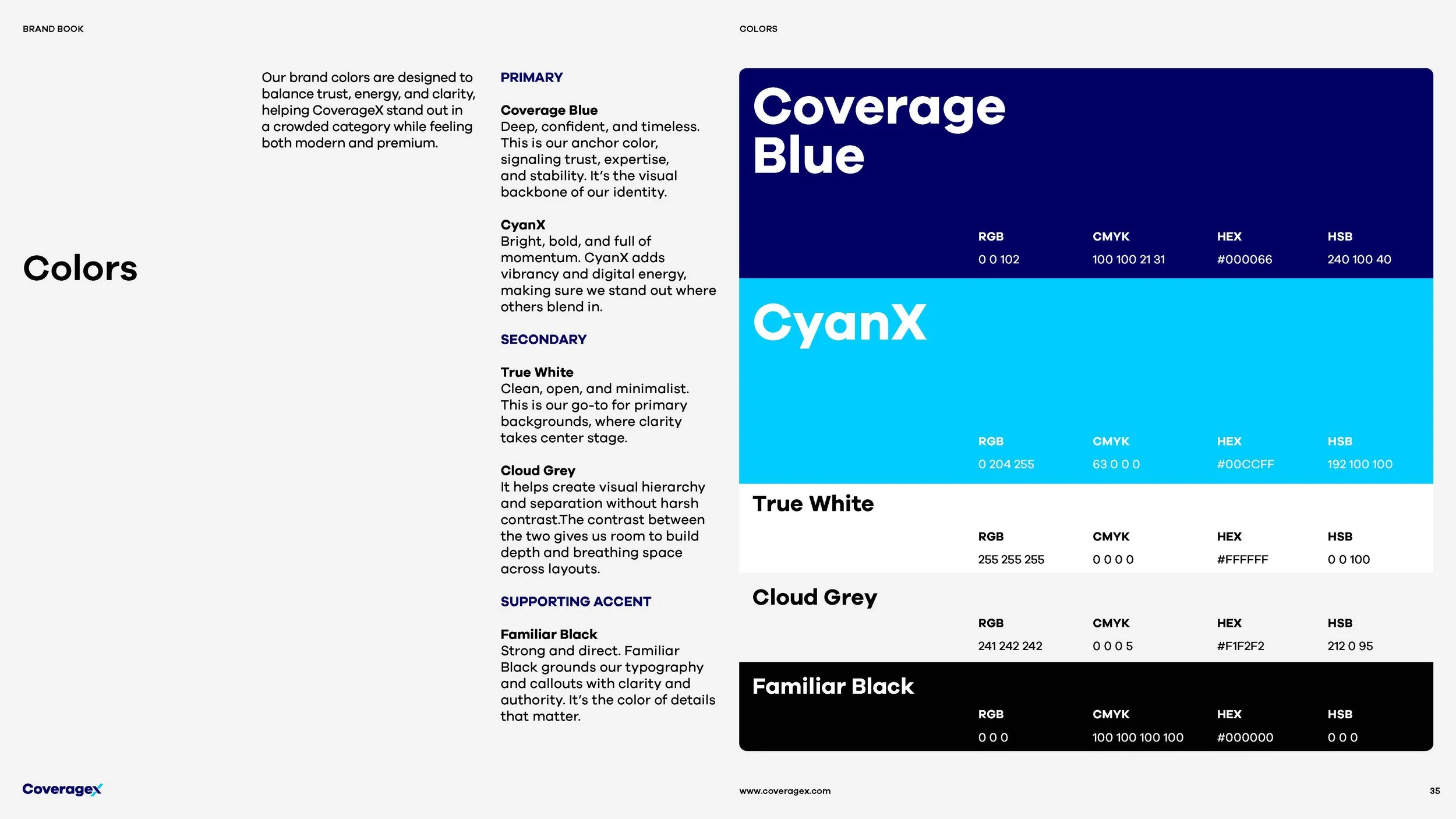
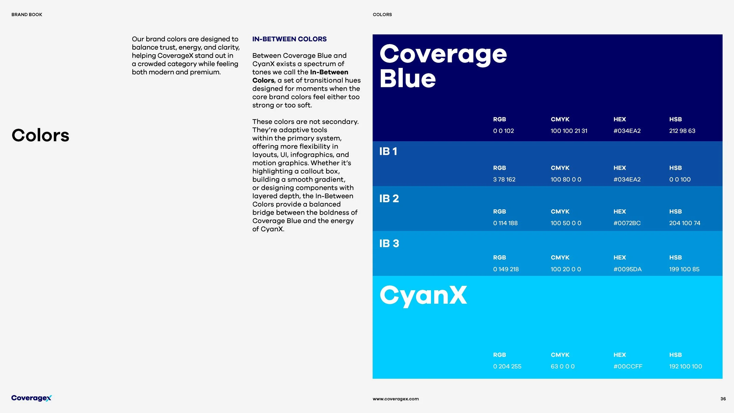
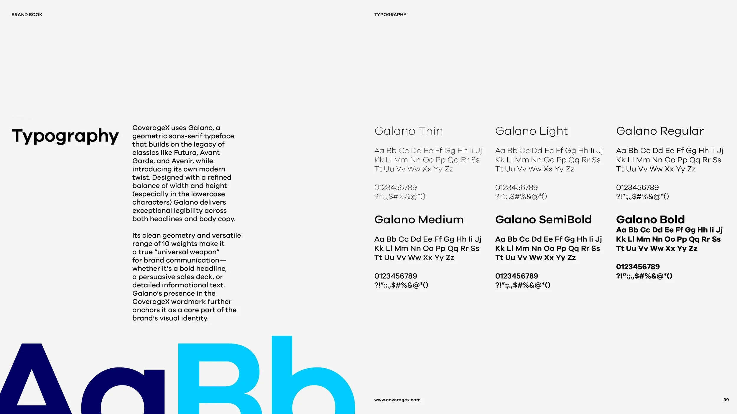
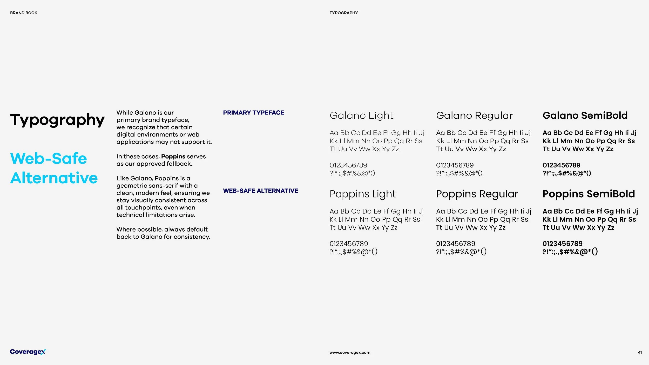
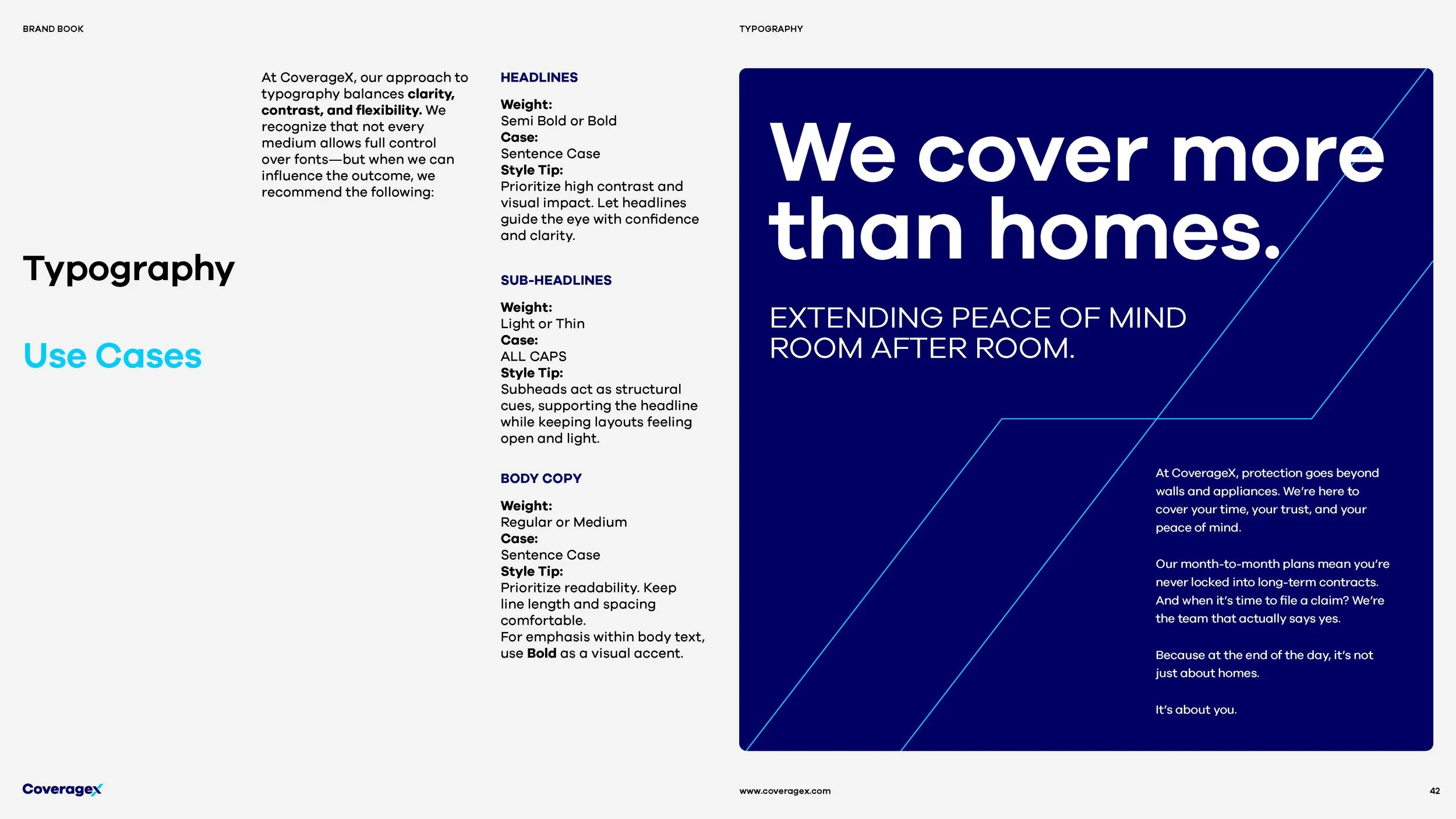
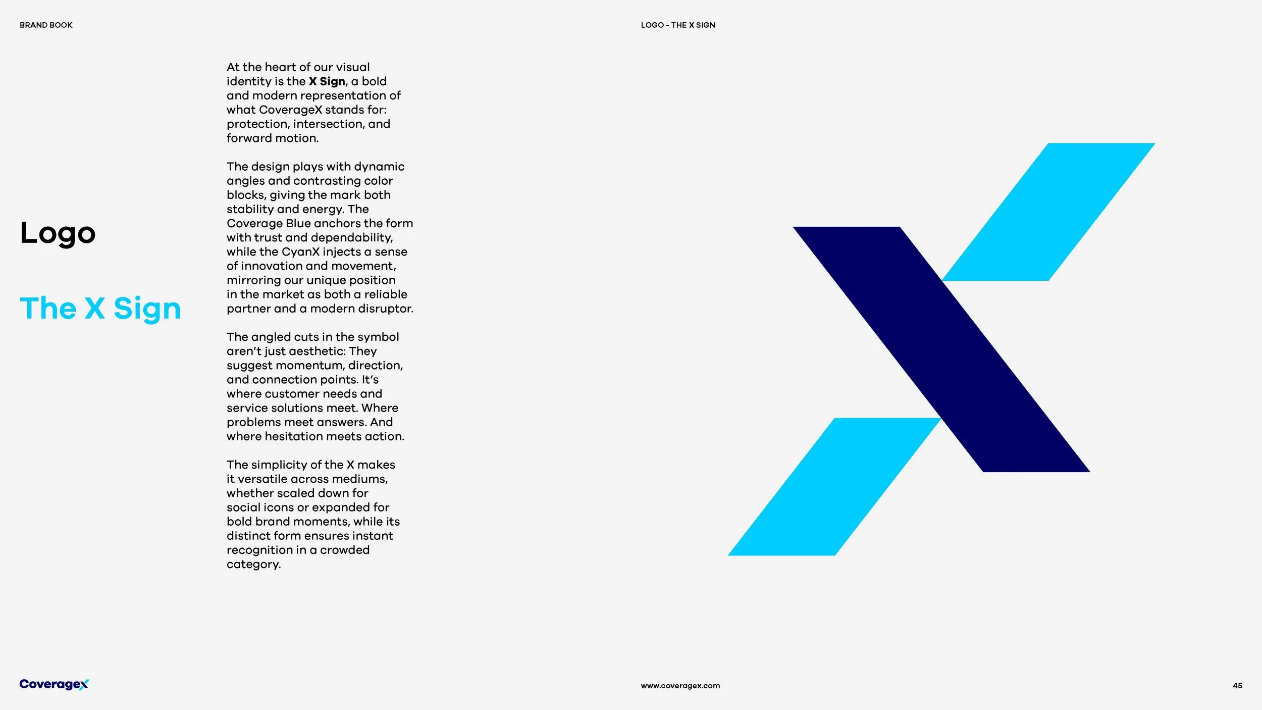
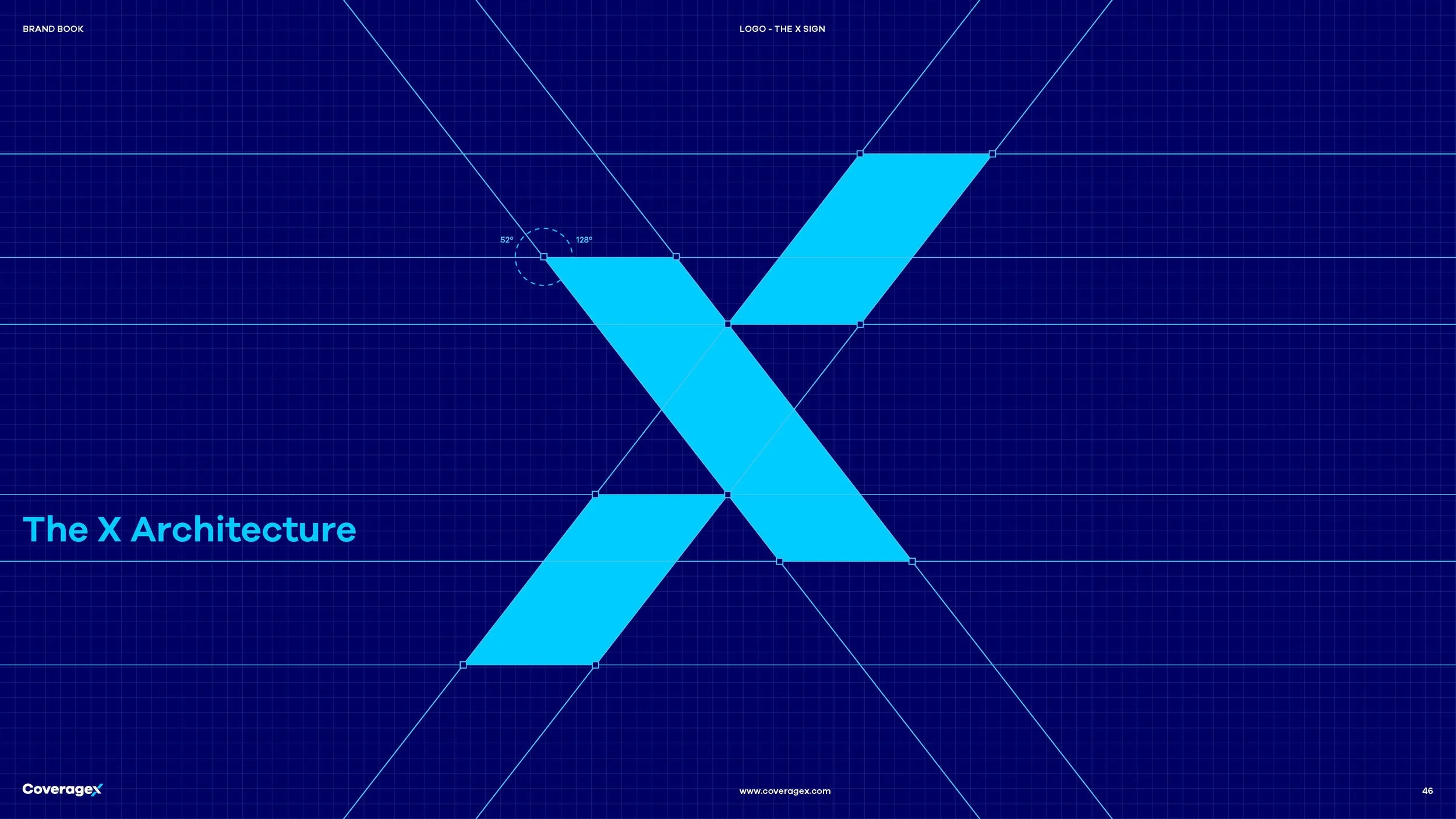
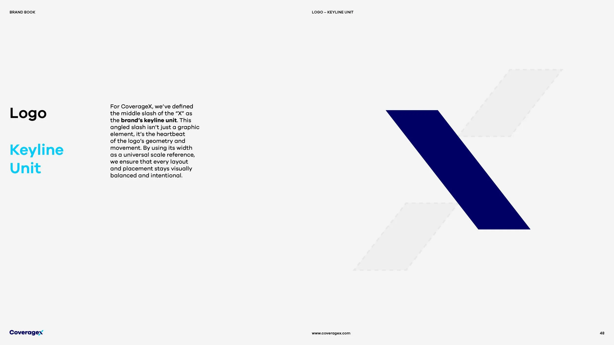
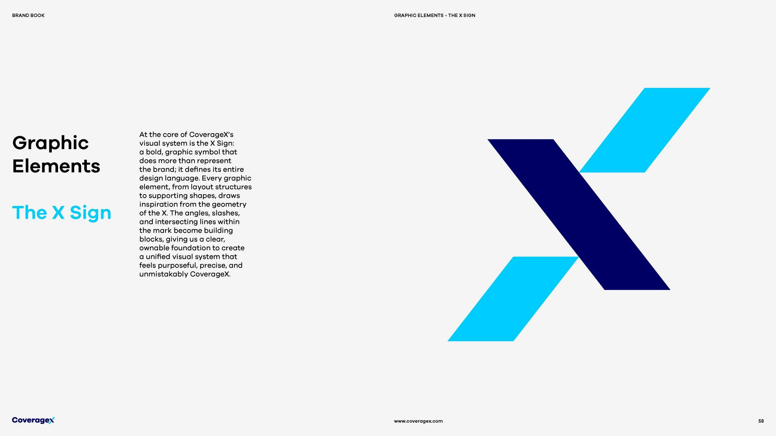
Its intersecting geometry represents protection, connection, and forward momentum, while a confident color palette and contemporary typography bring clarity and personality to the brand.
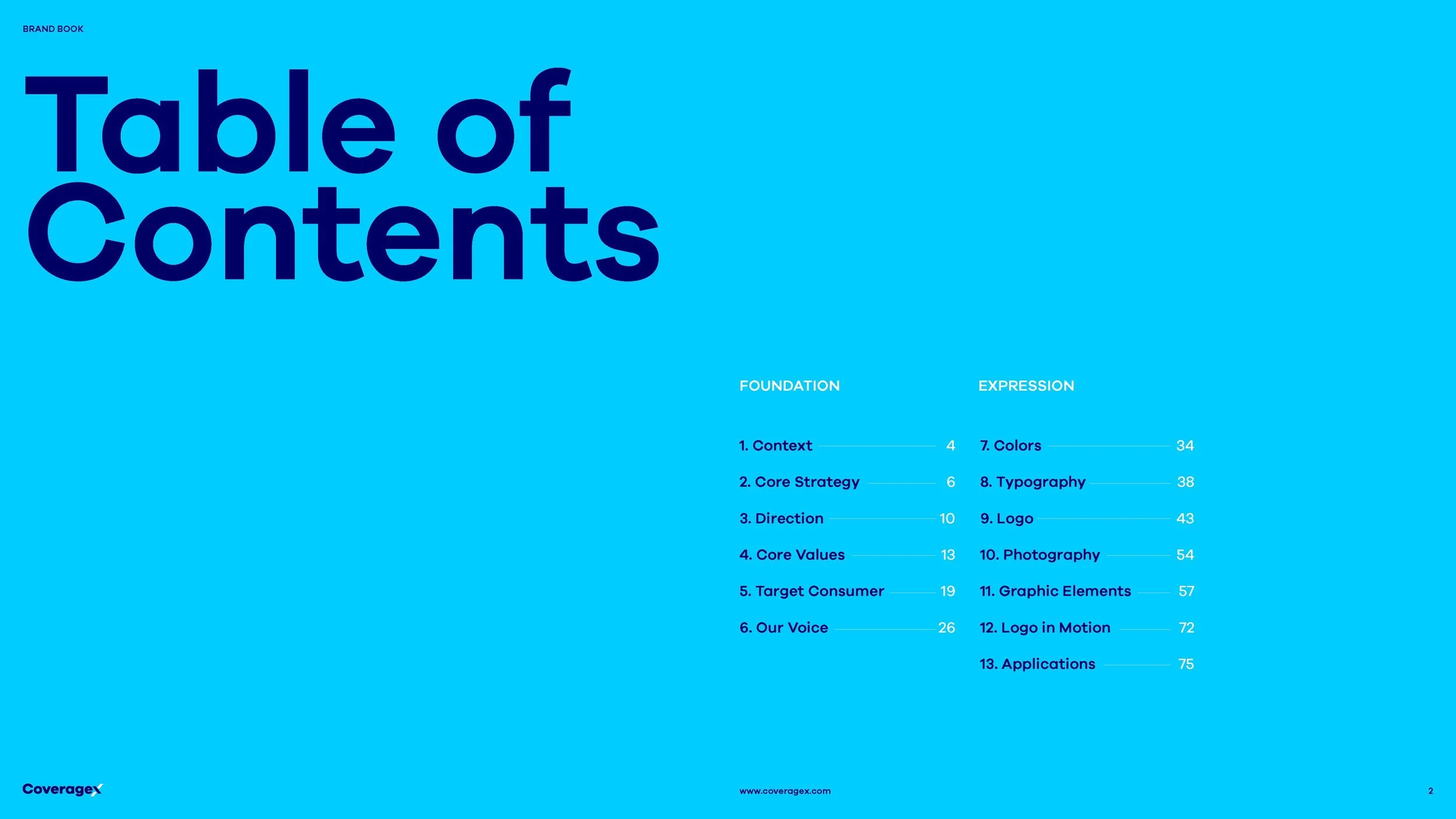
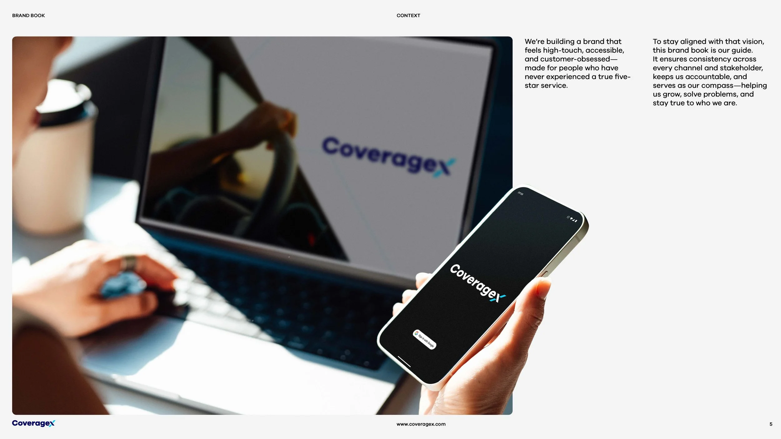
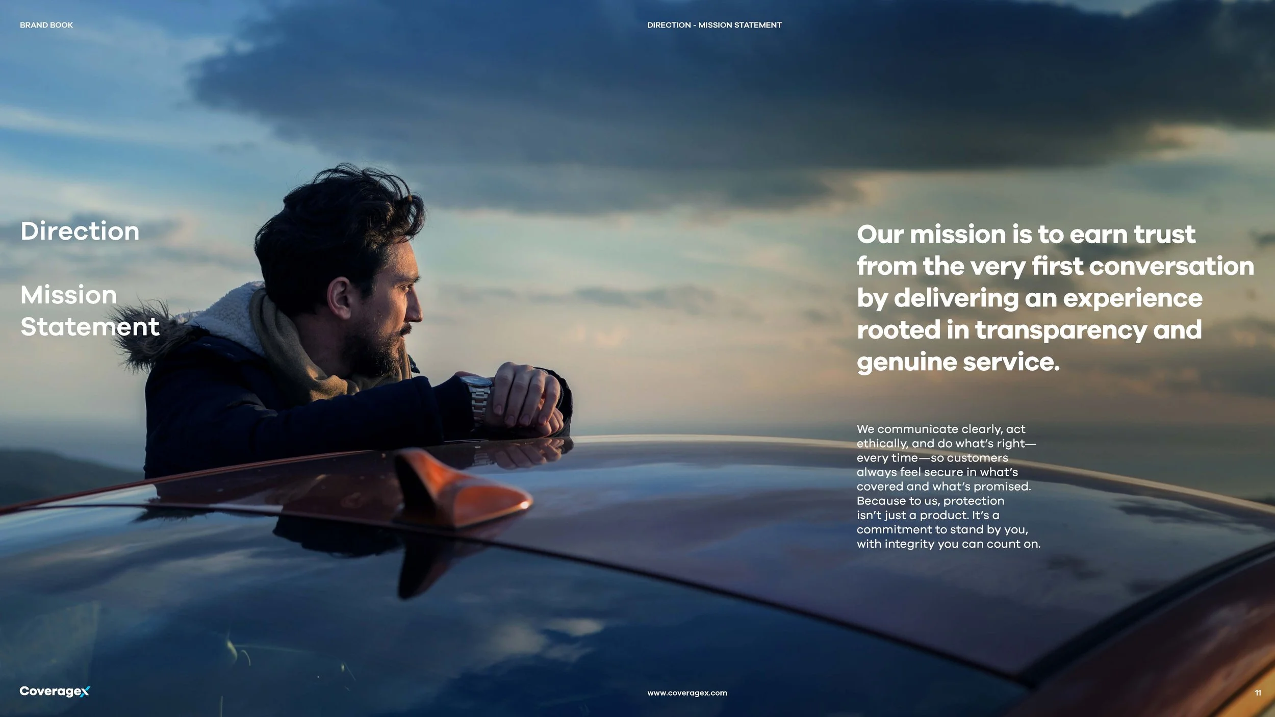
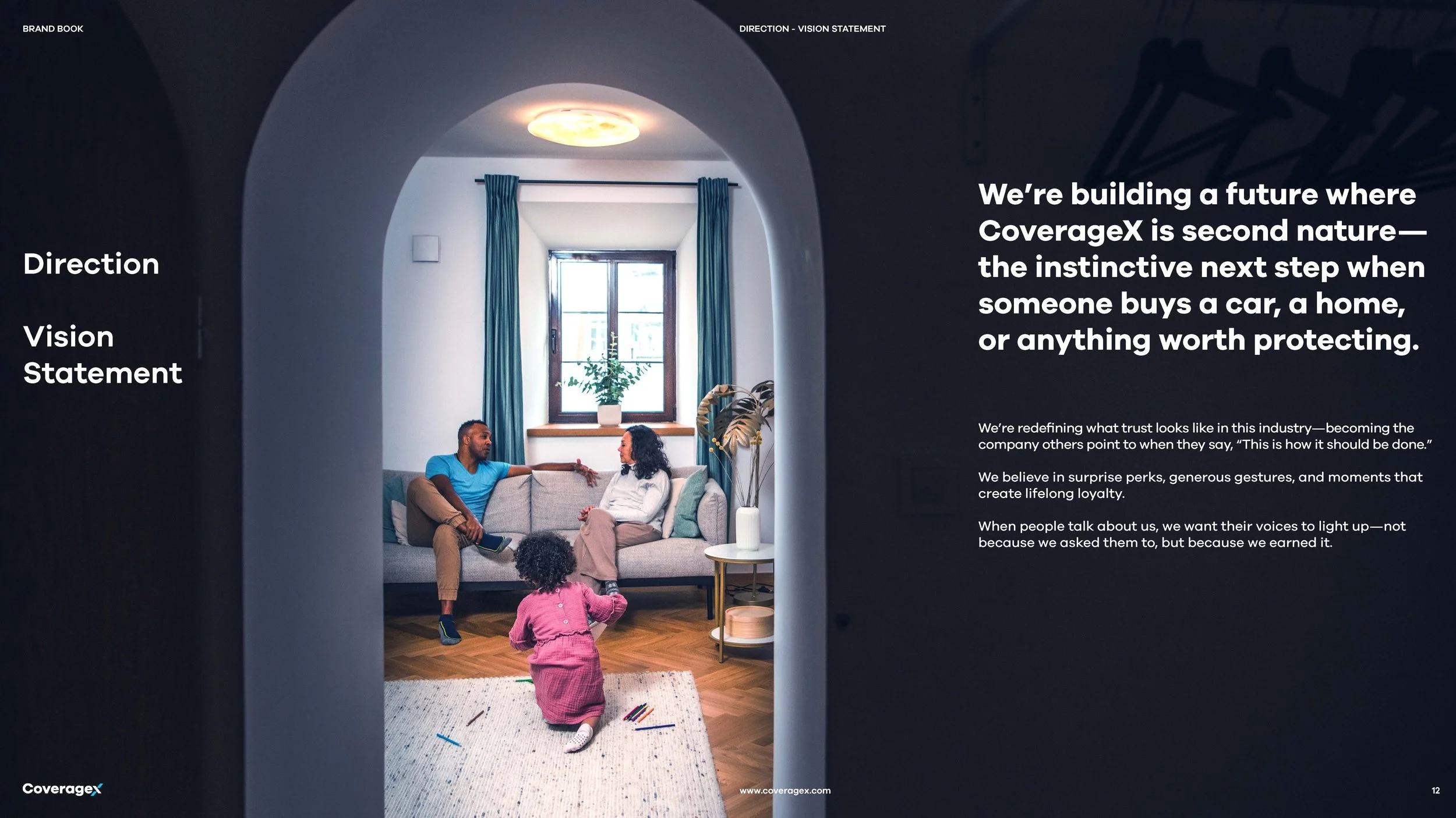
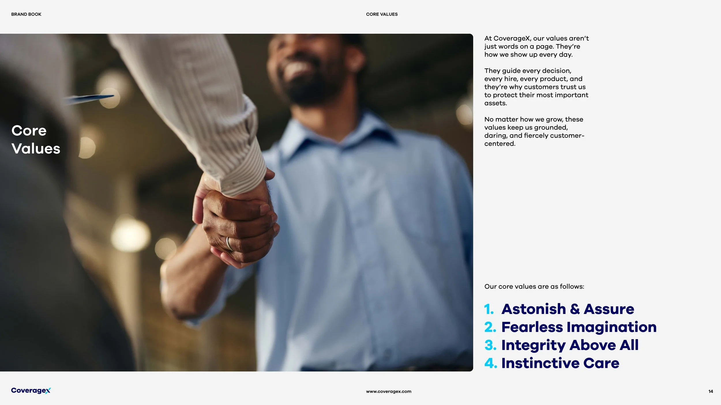
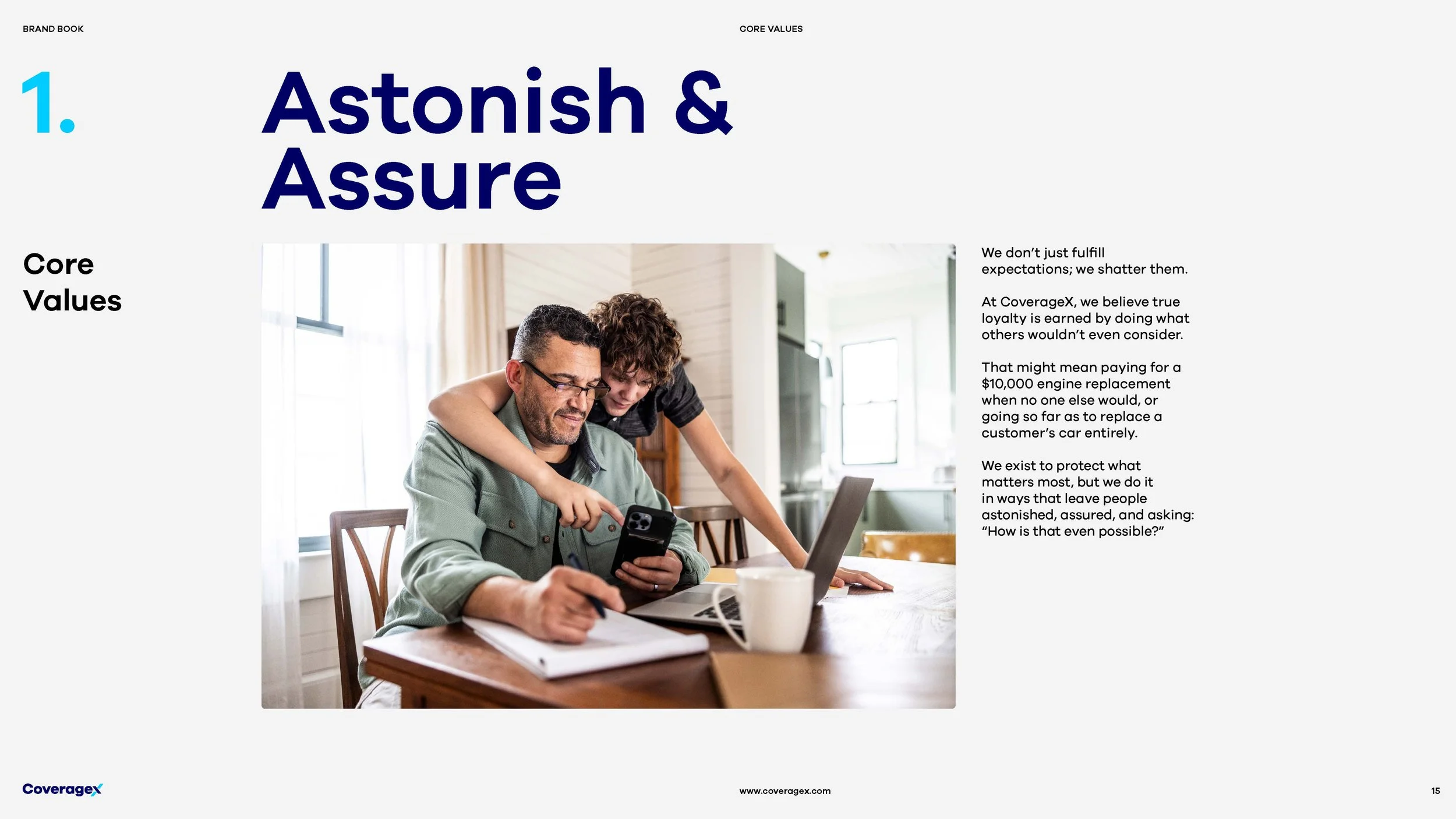
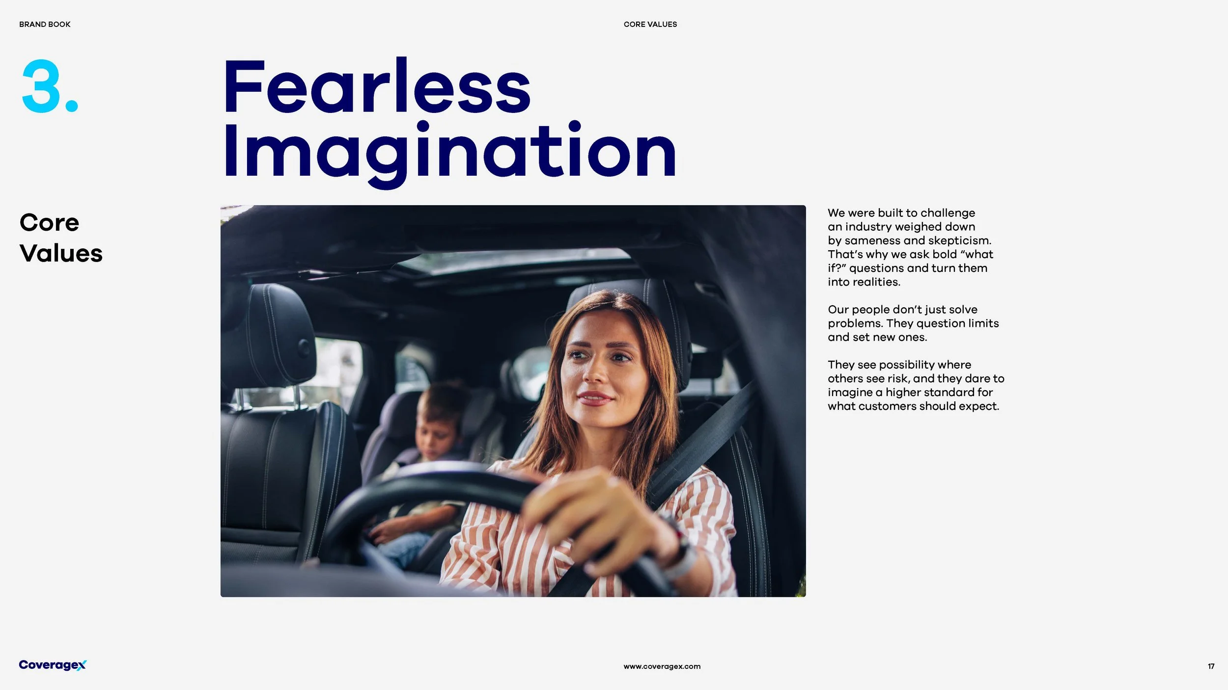
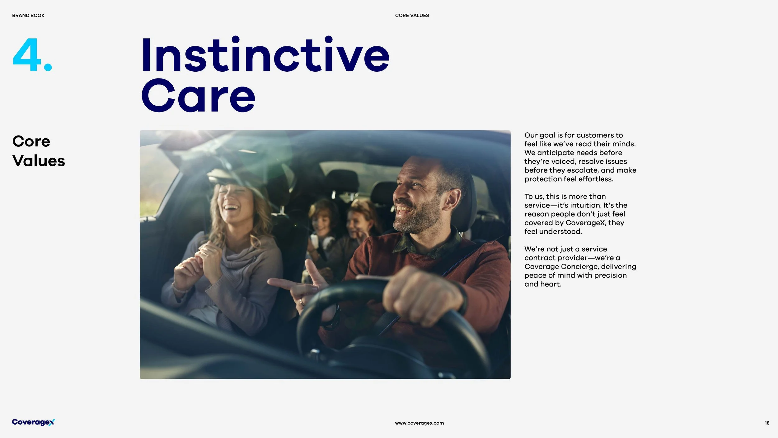
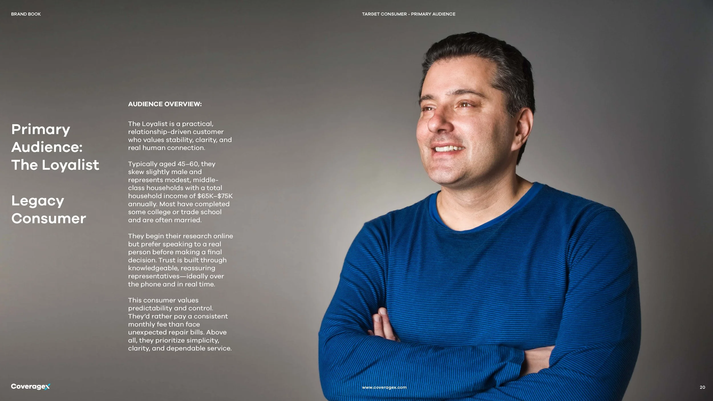
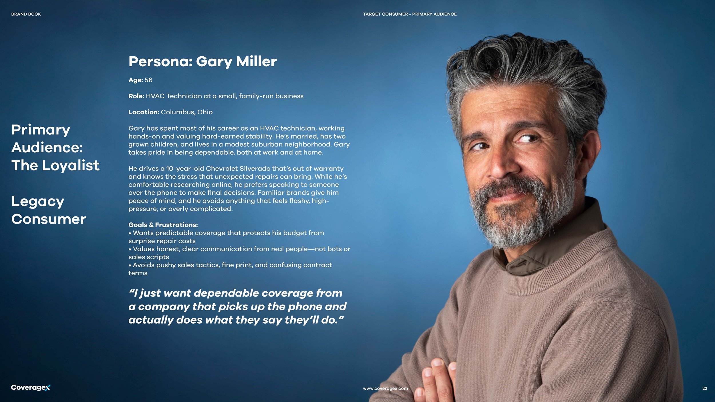
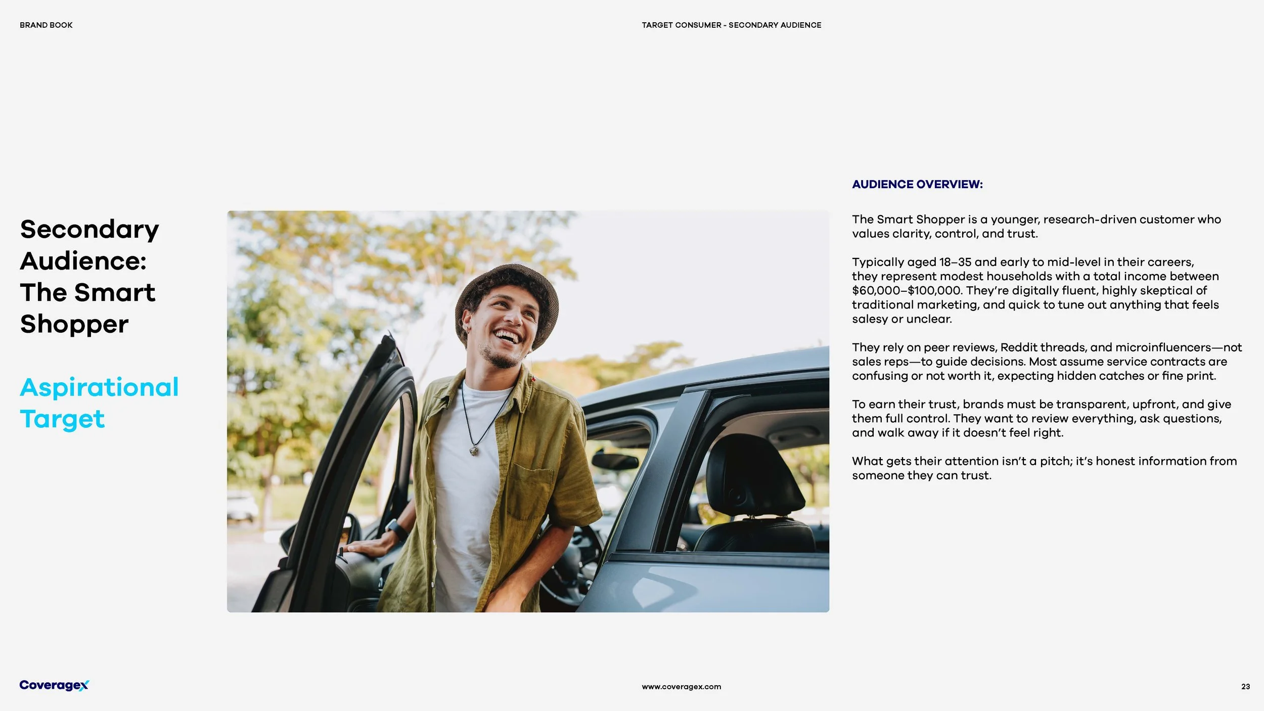
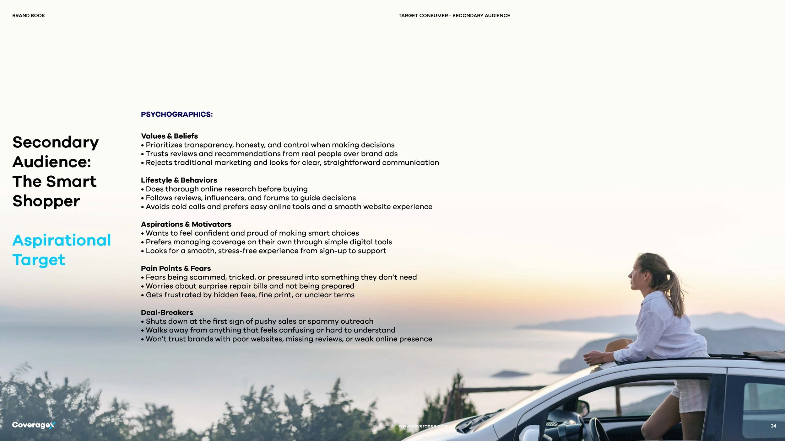
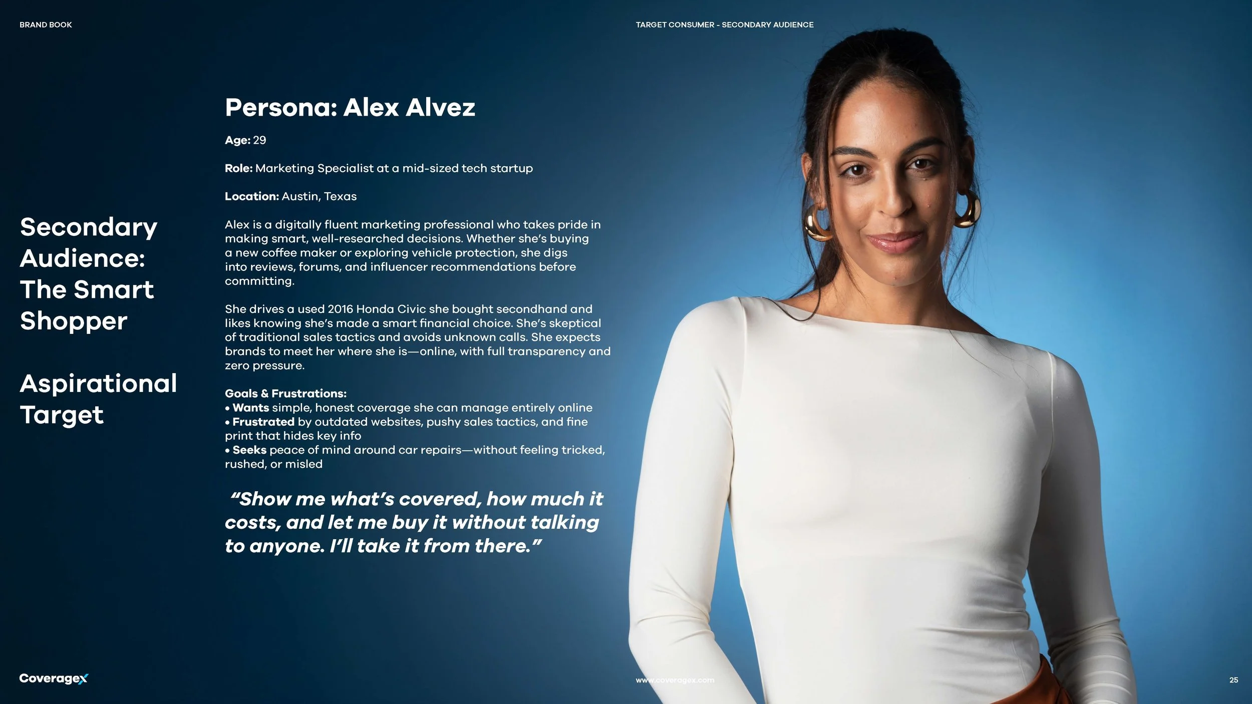
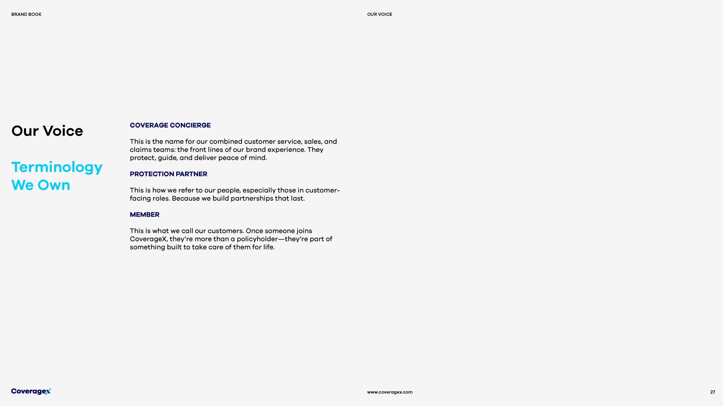
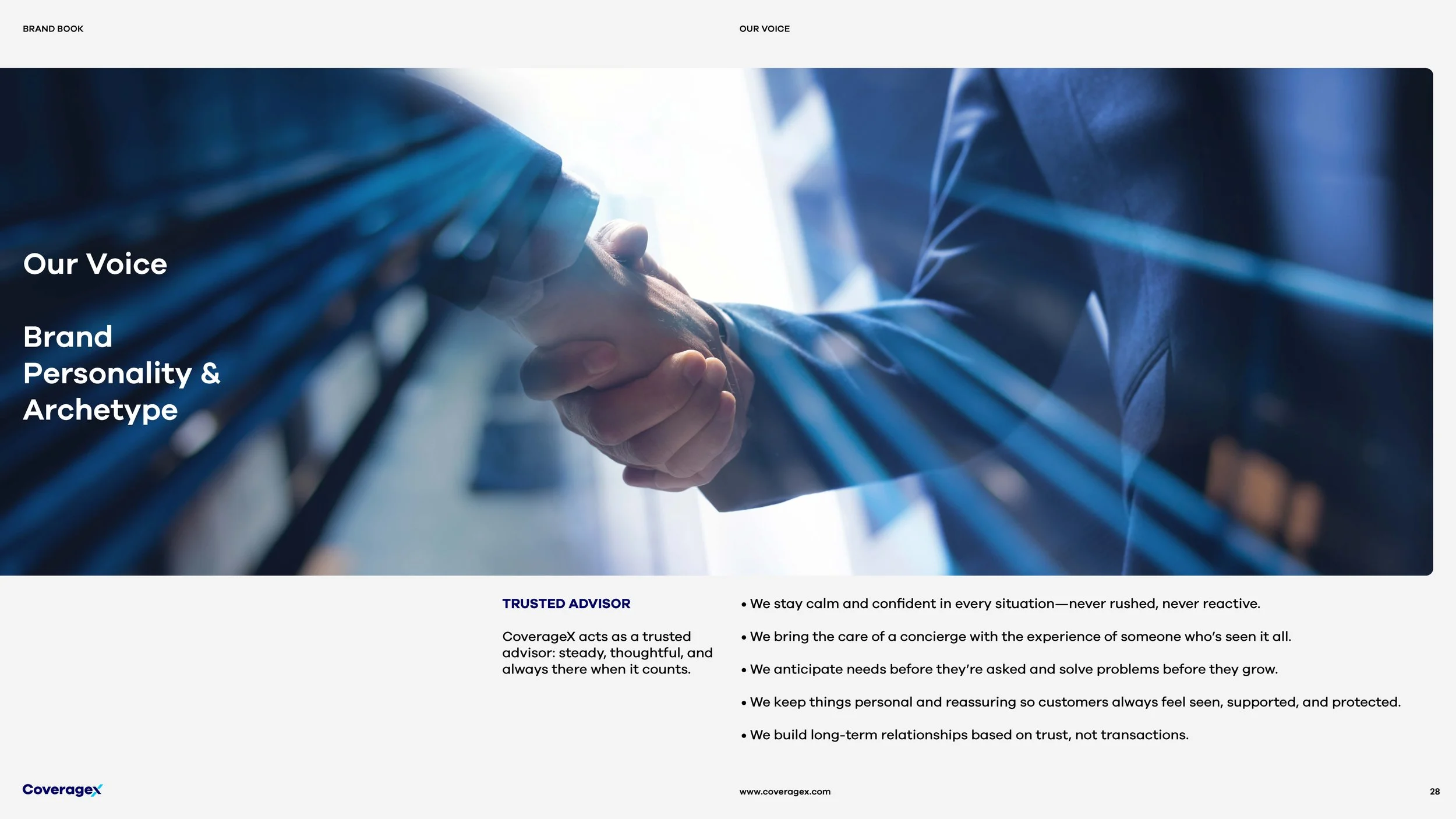
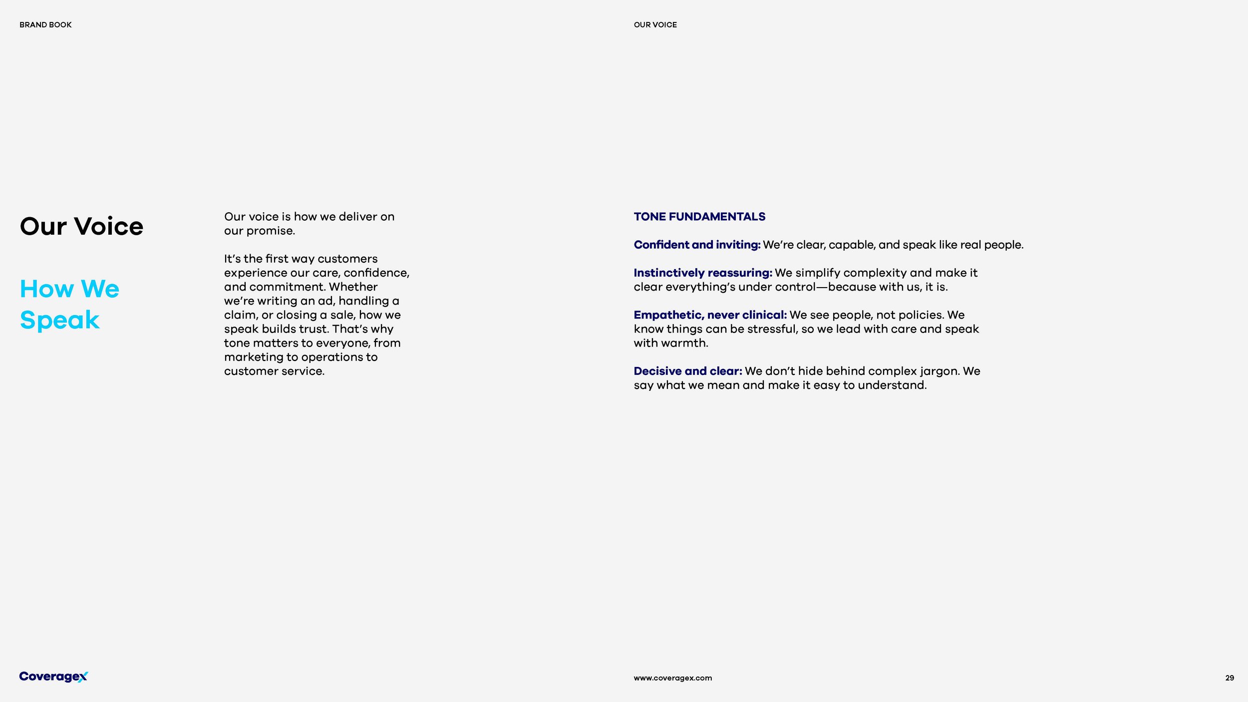
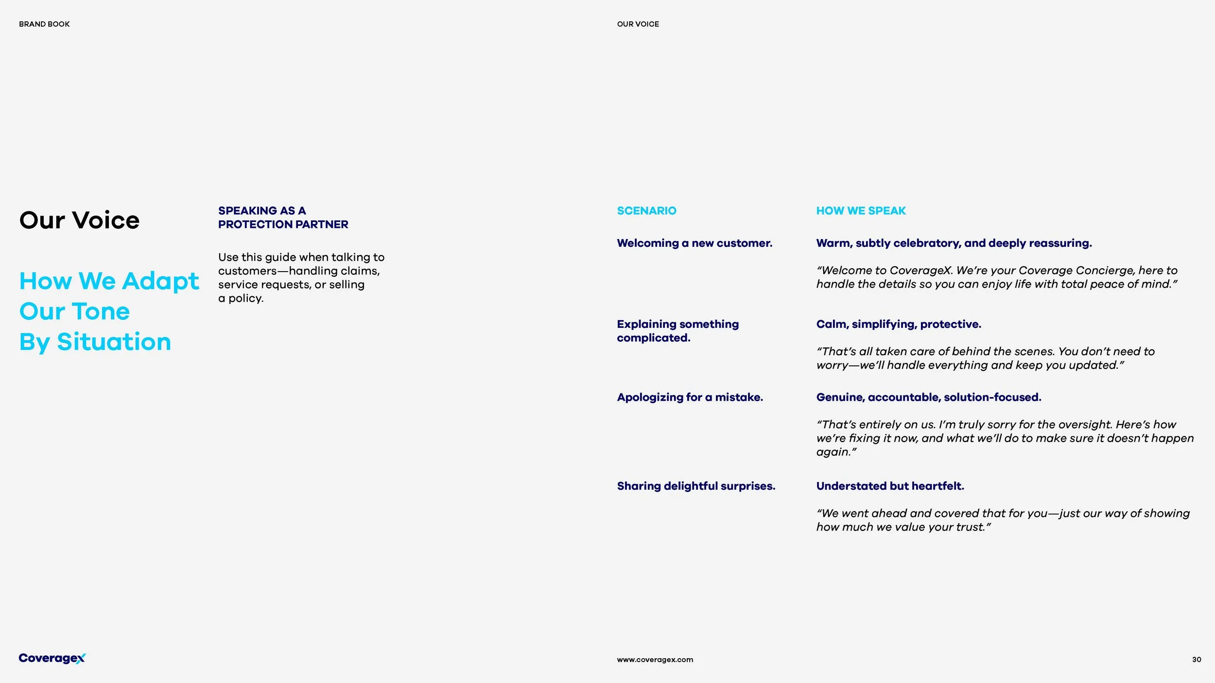
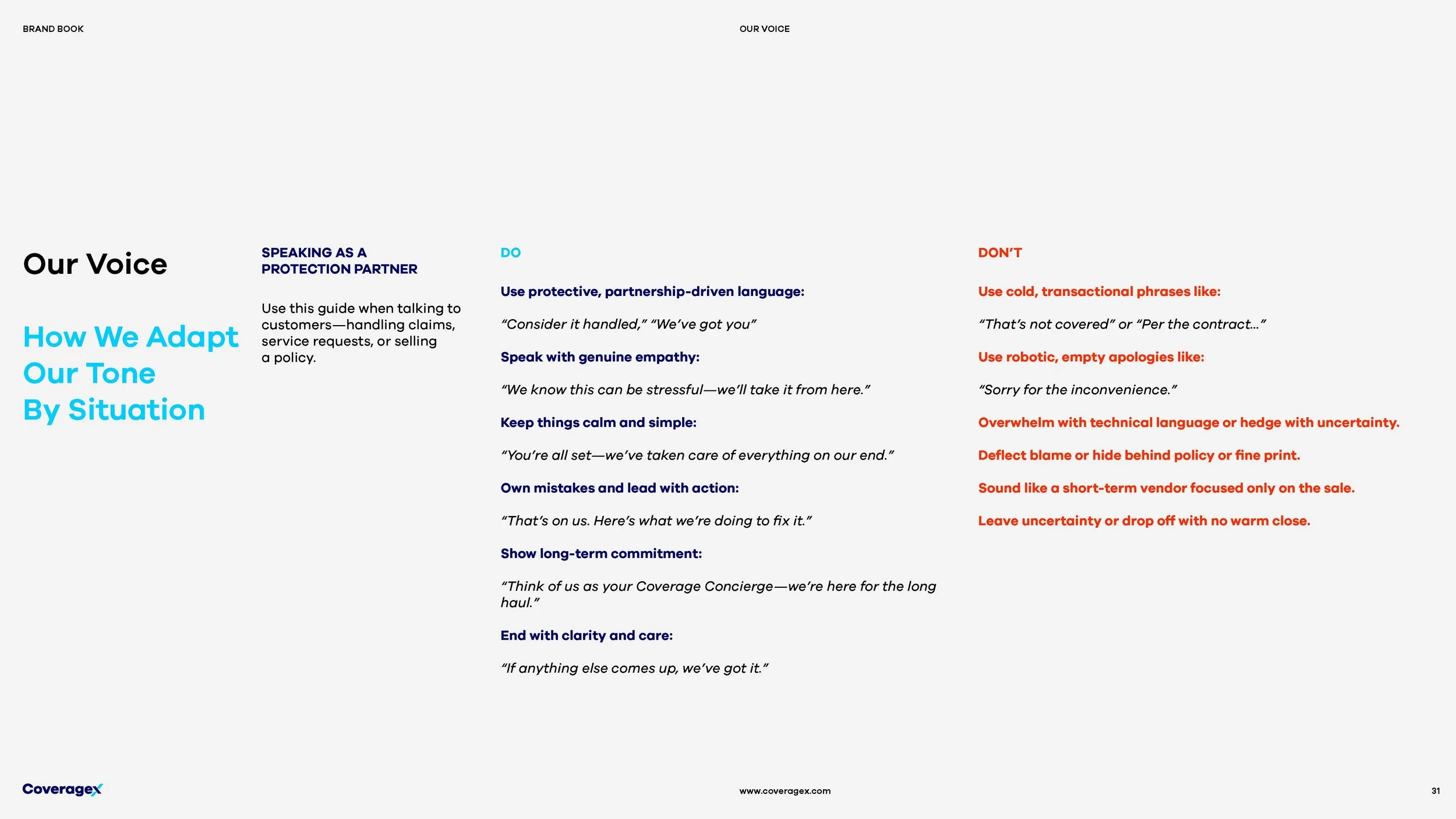
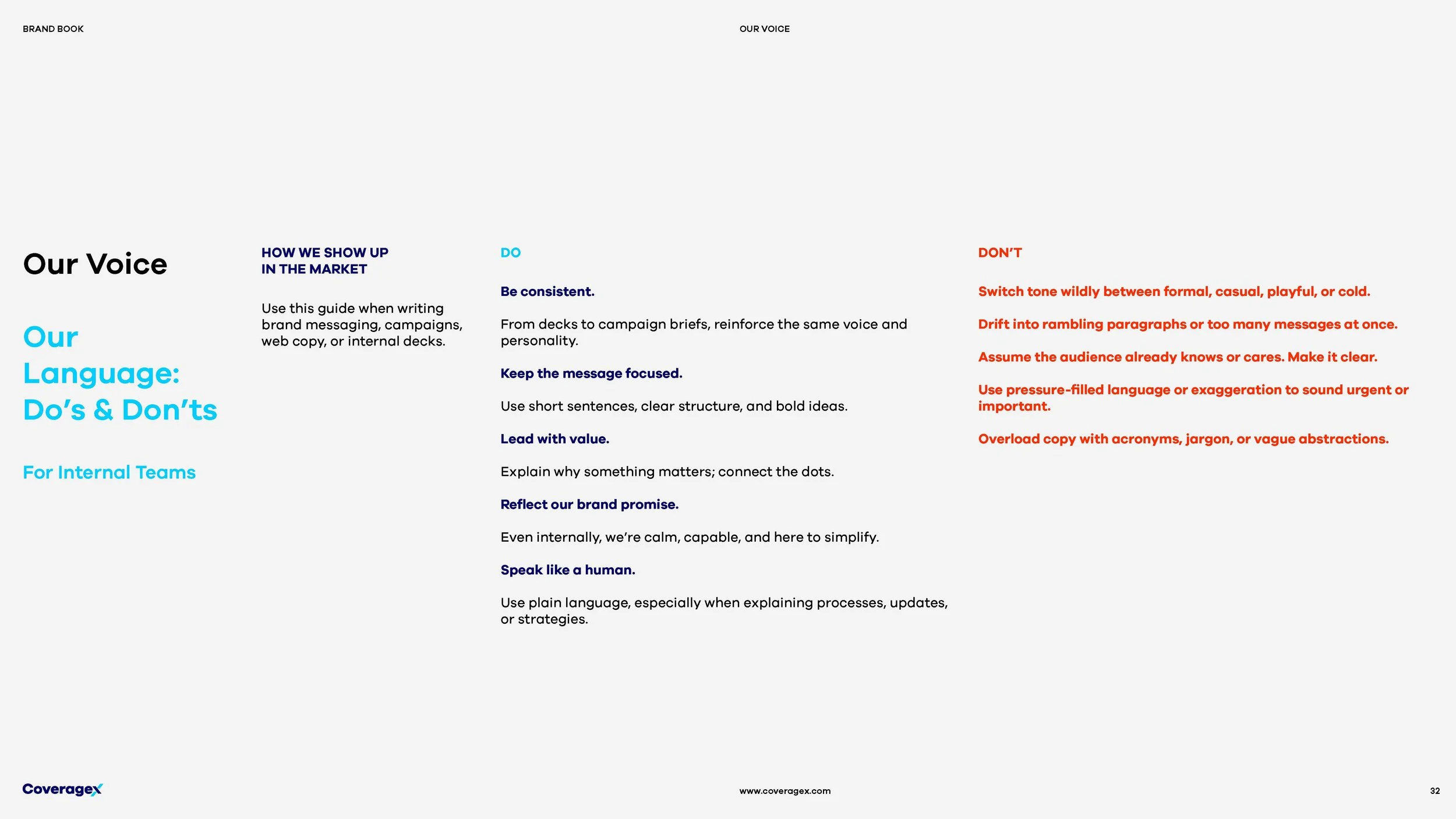
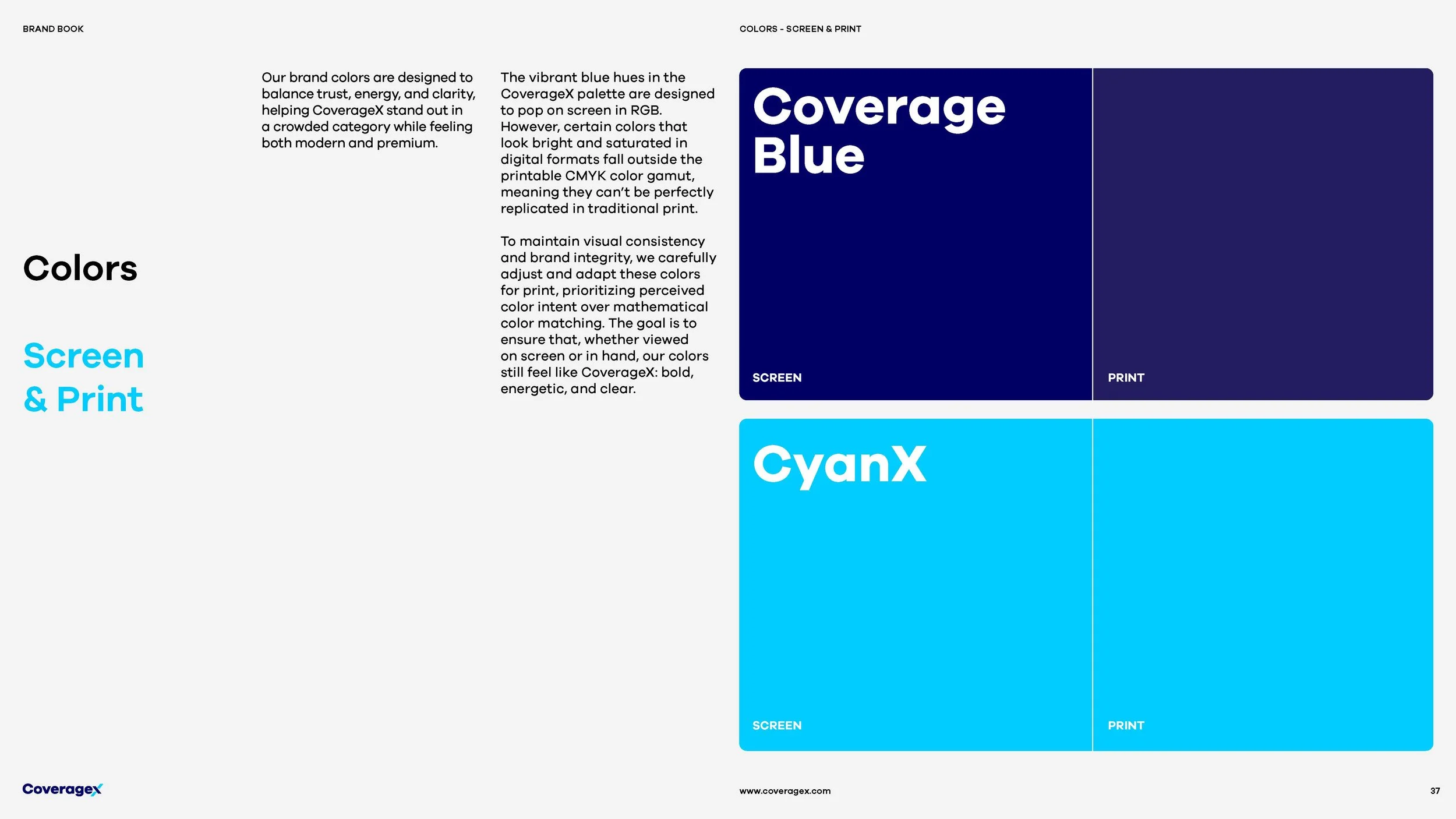
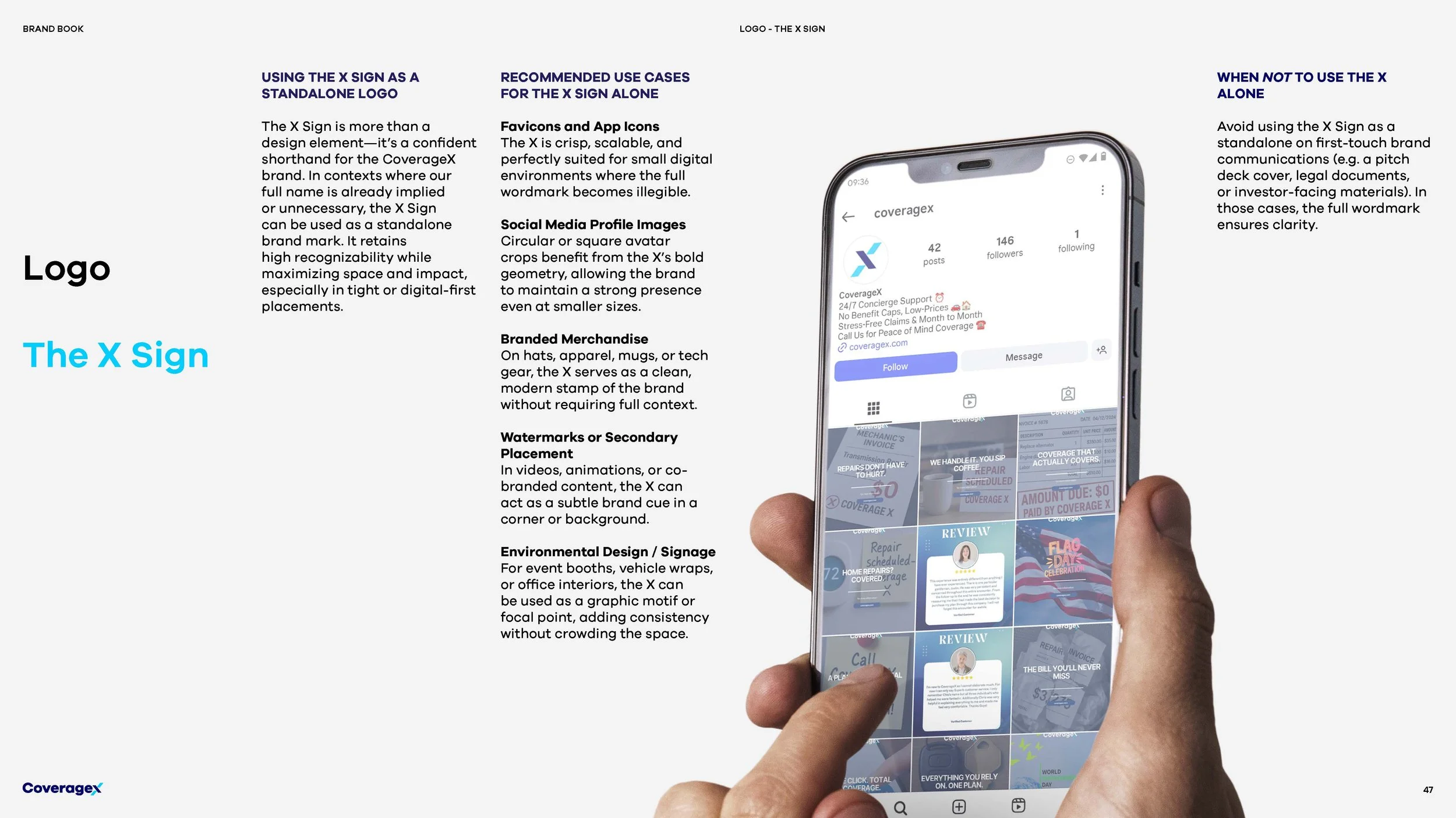
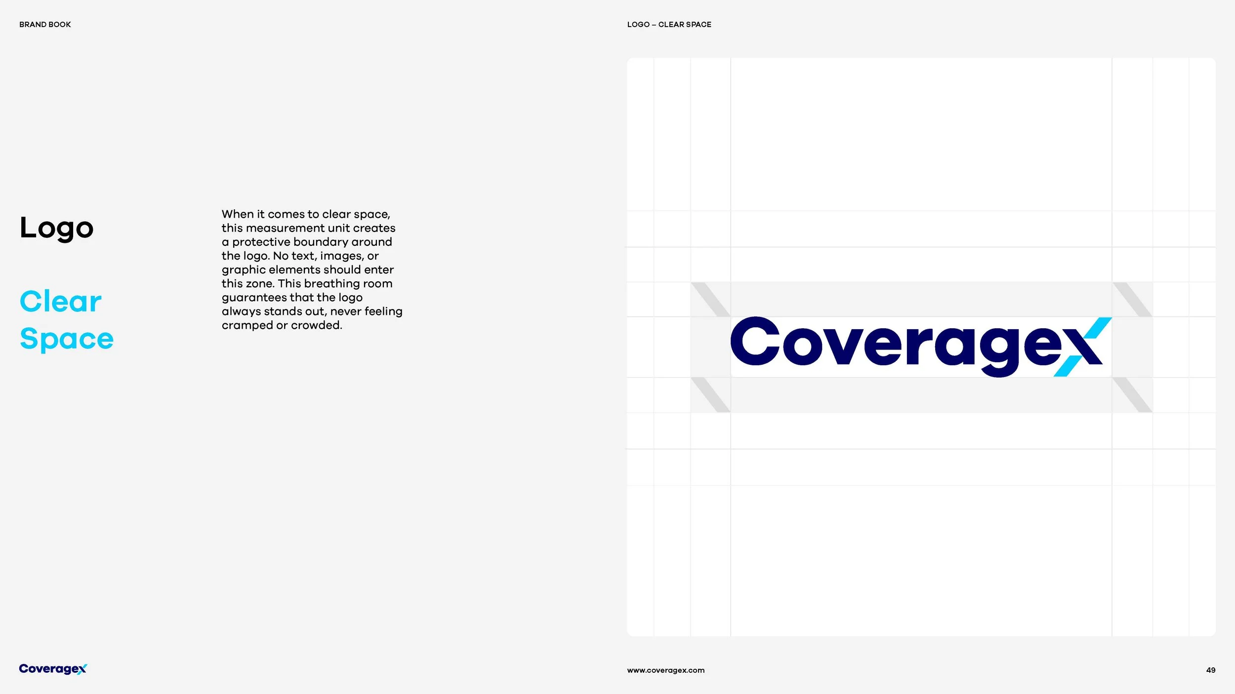
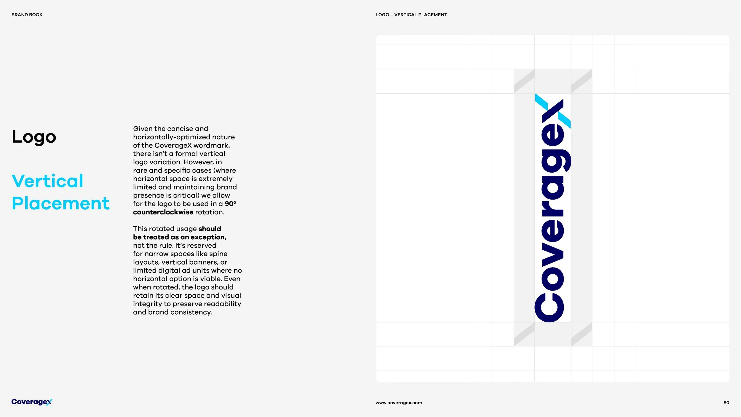
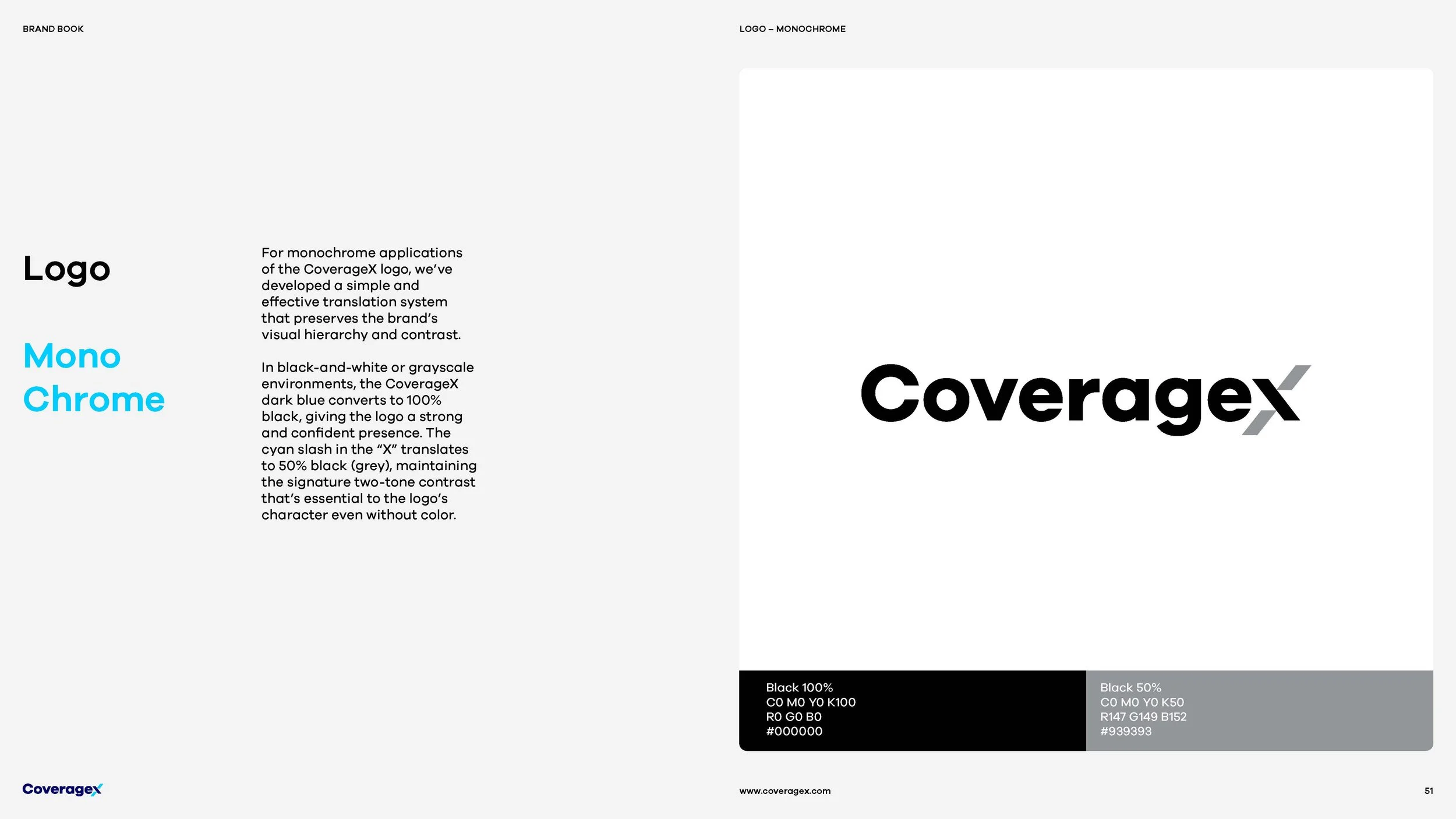
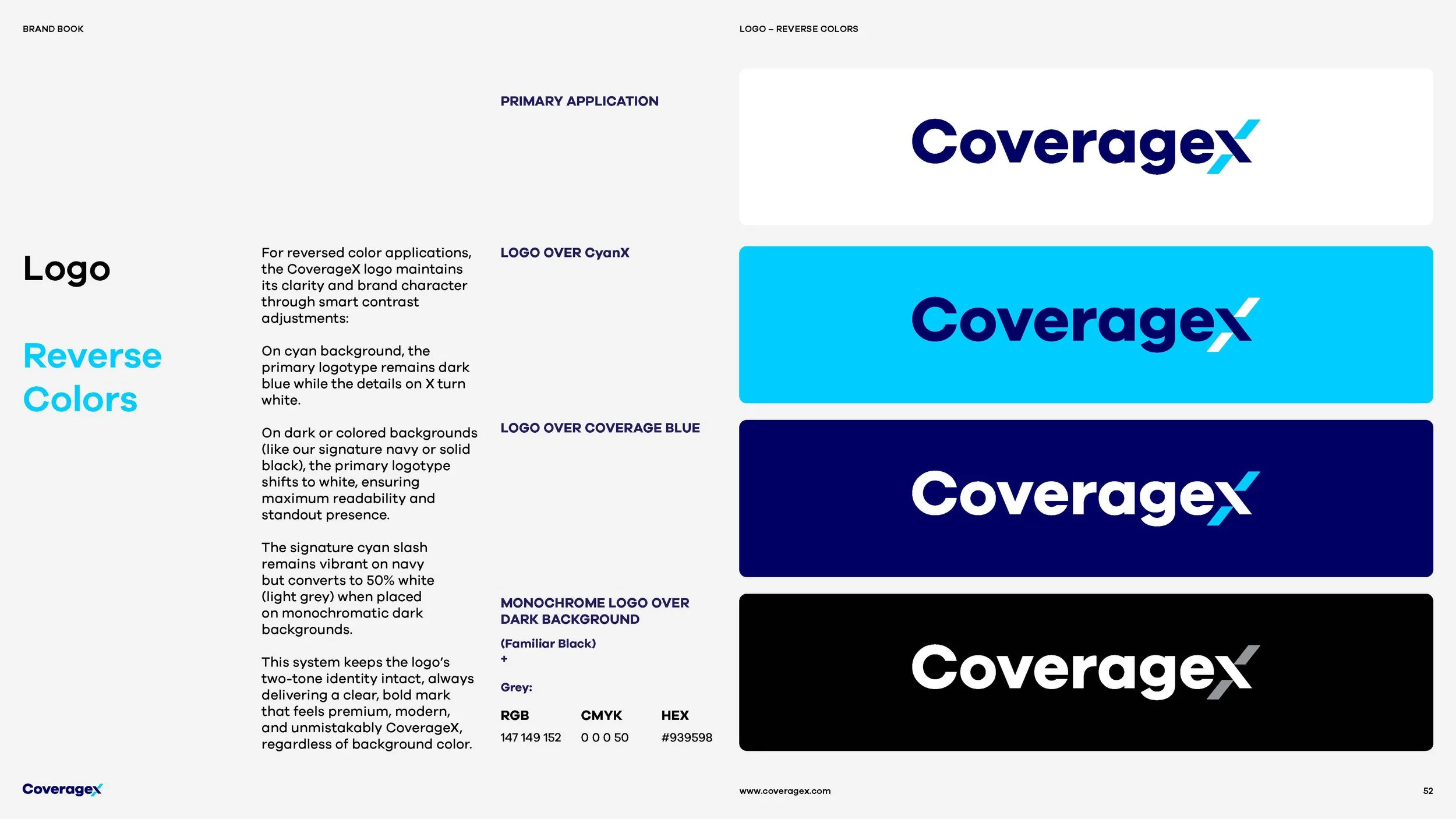
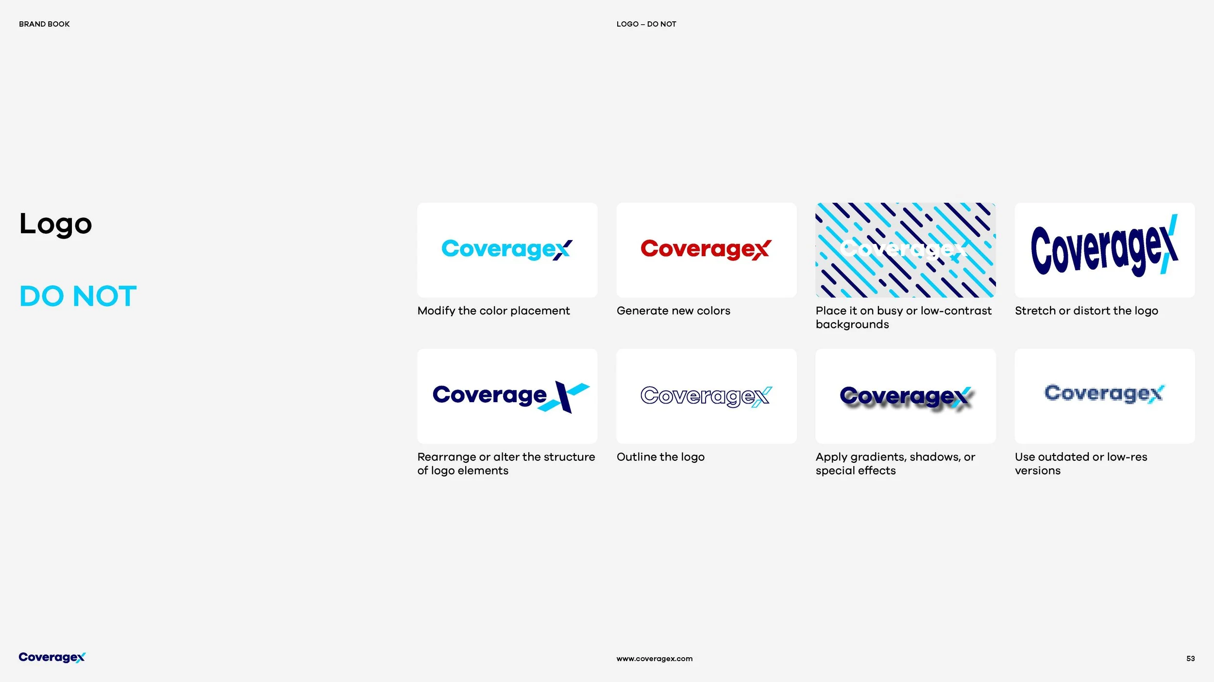
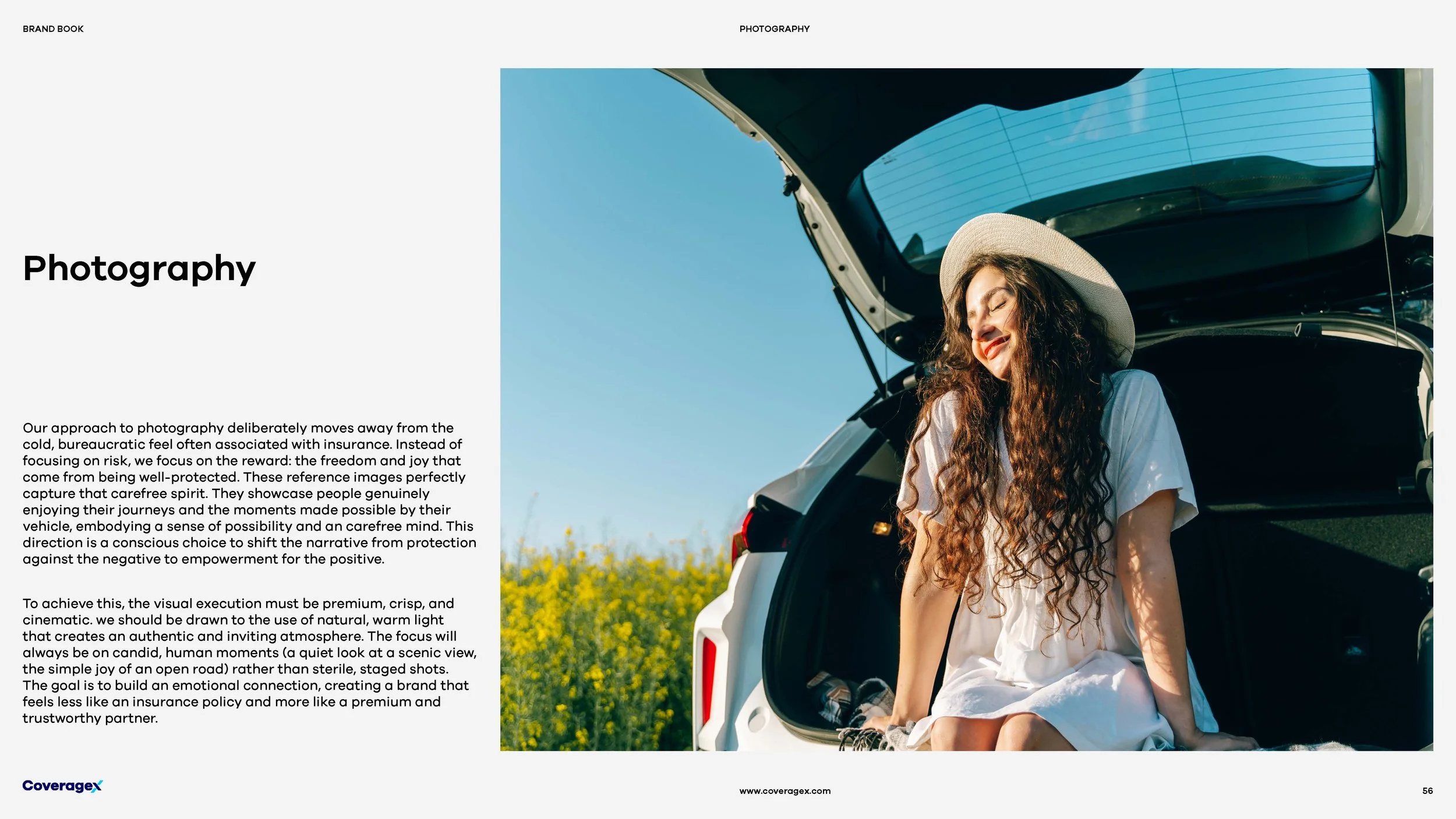
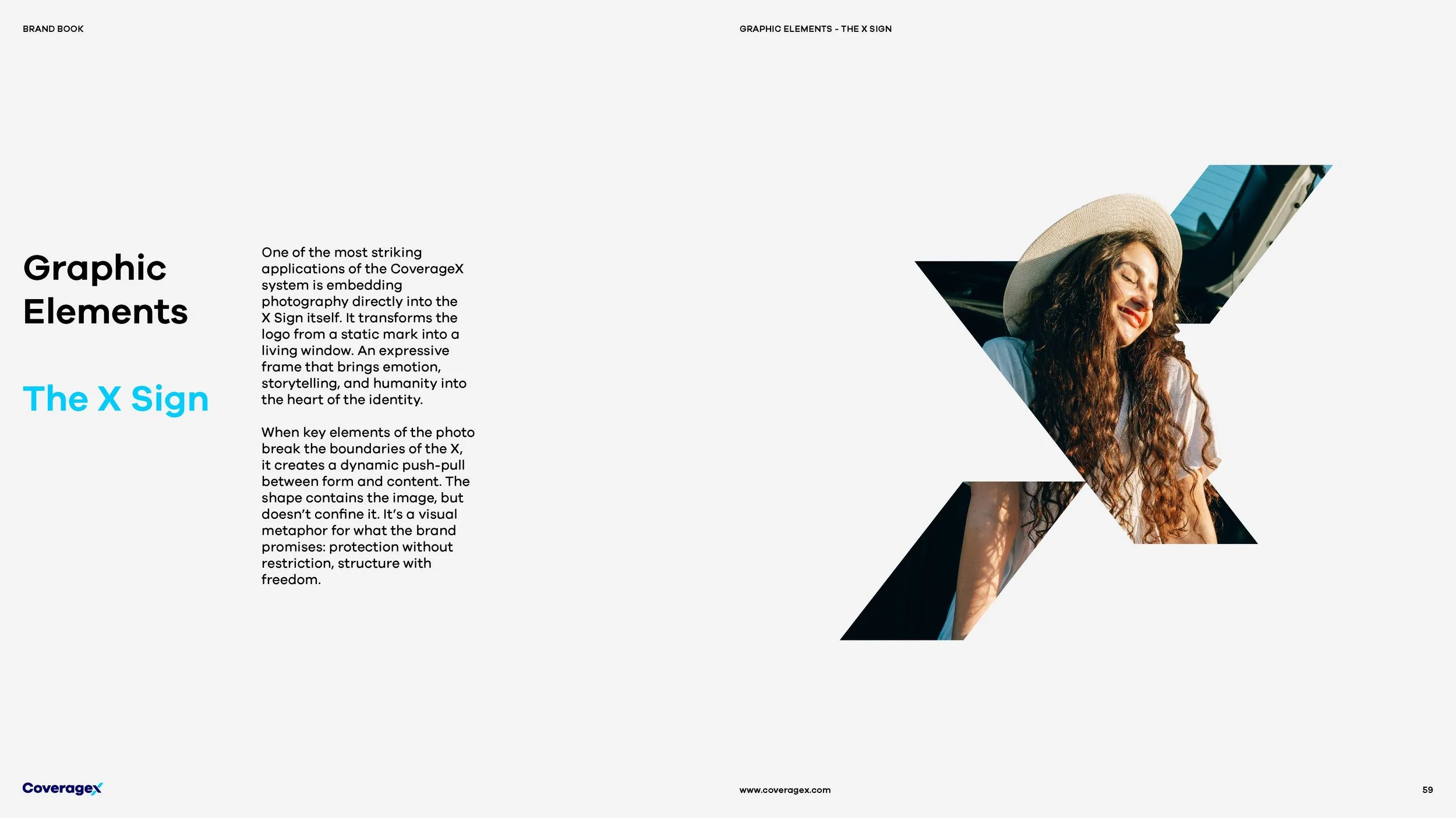
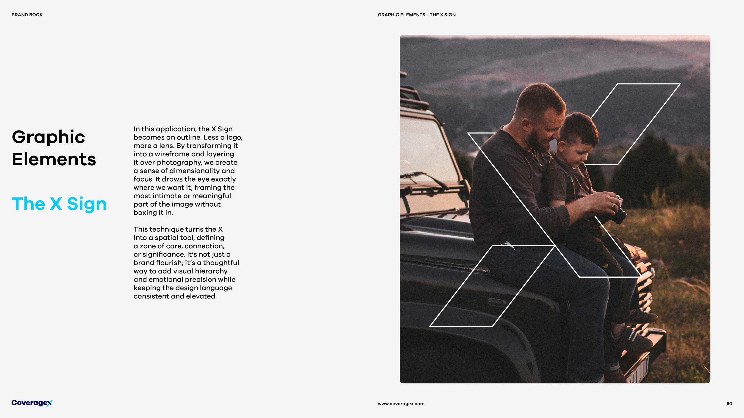
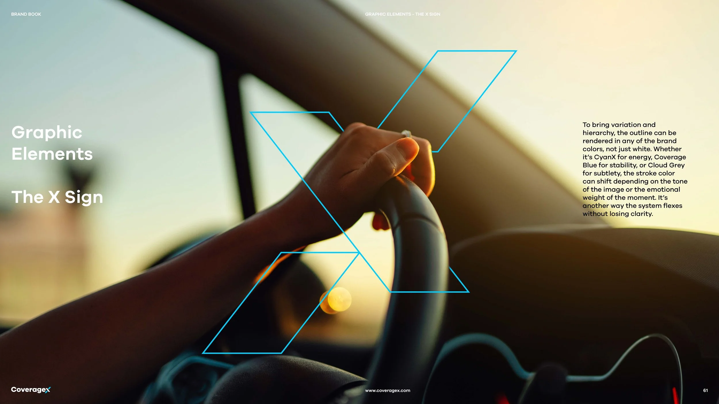
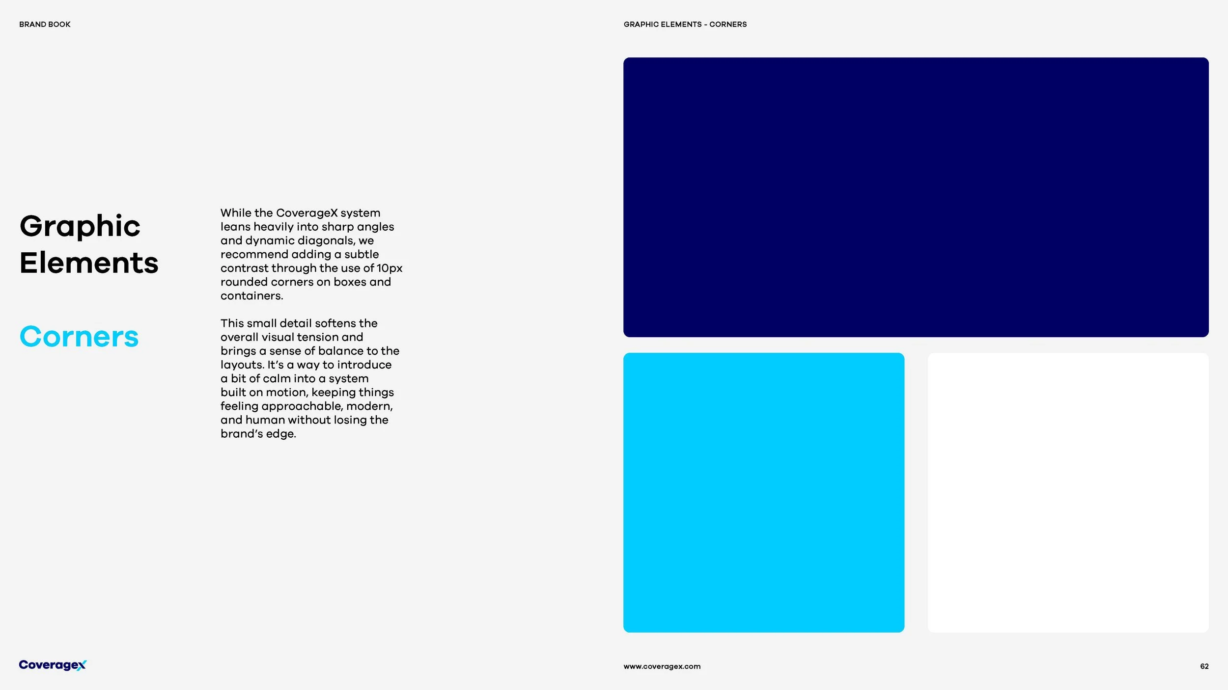
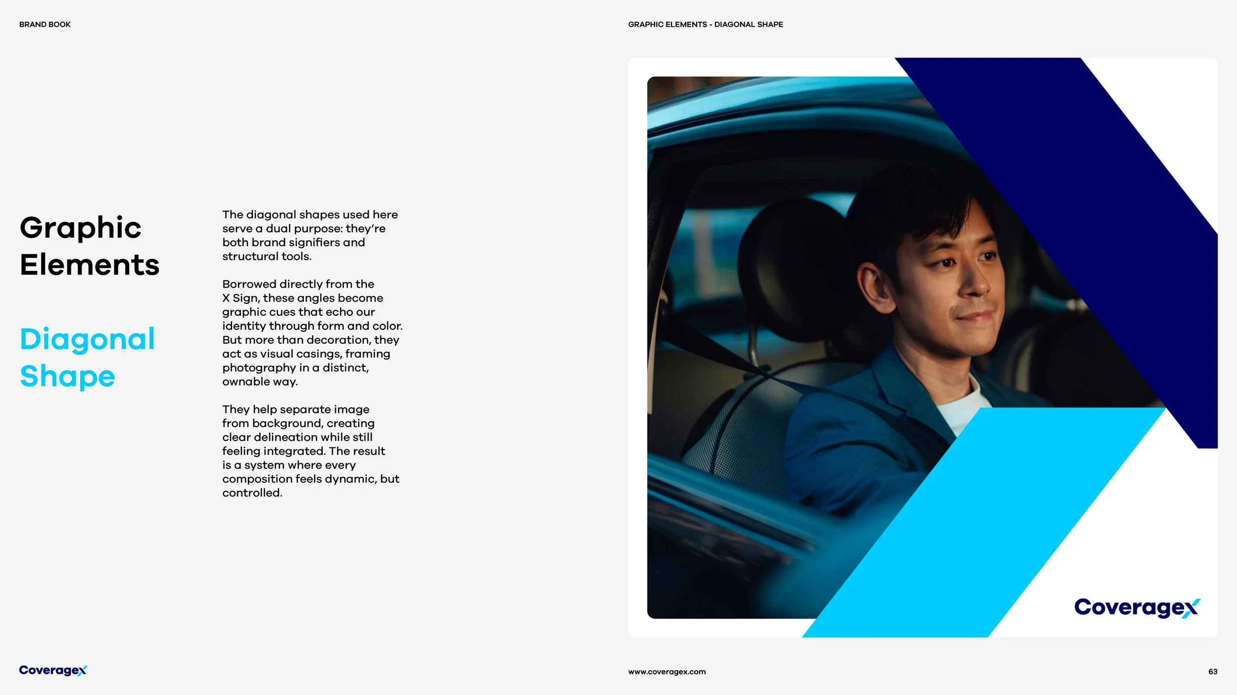
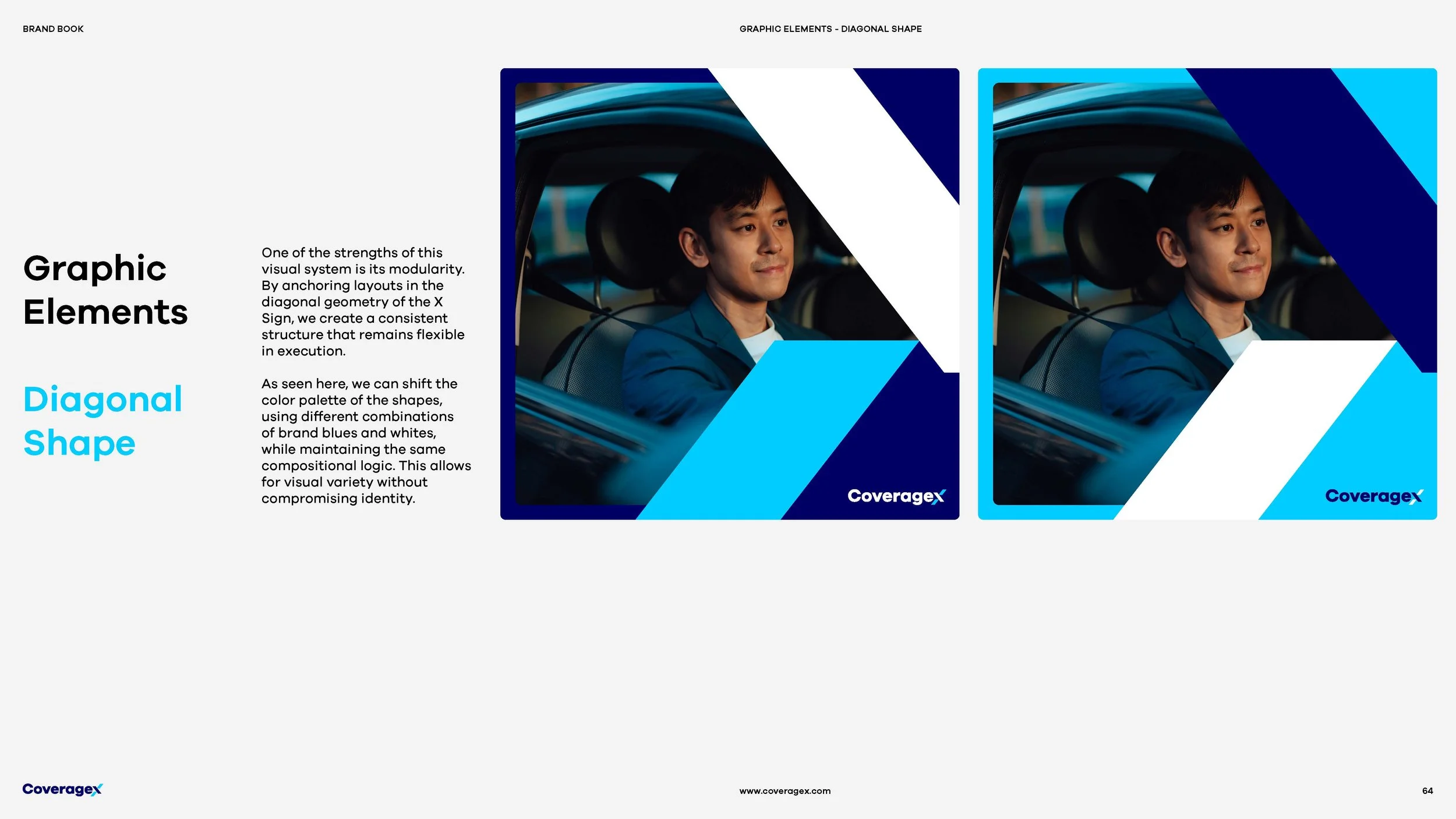
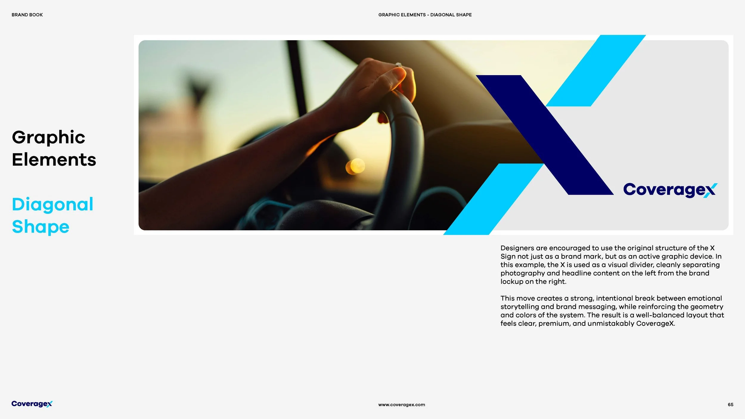
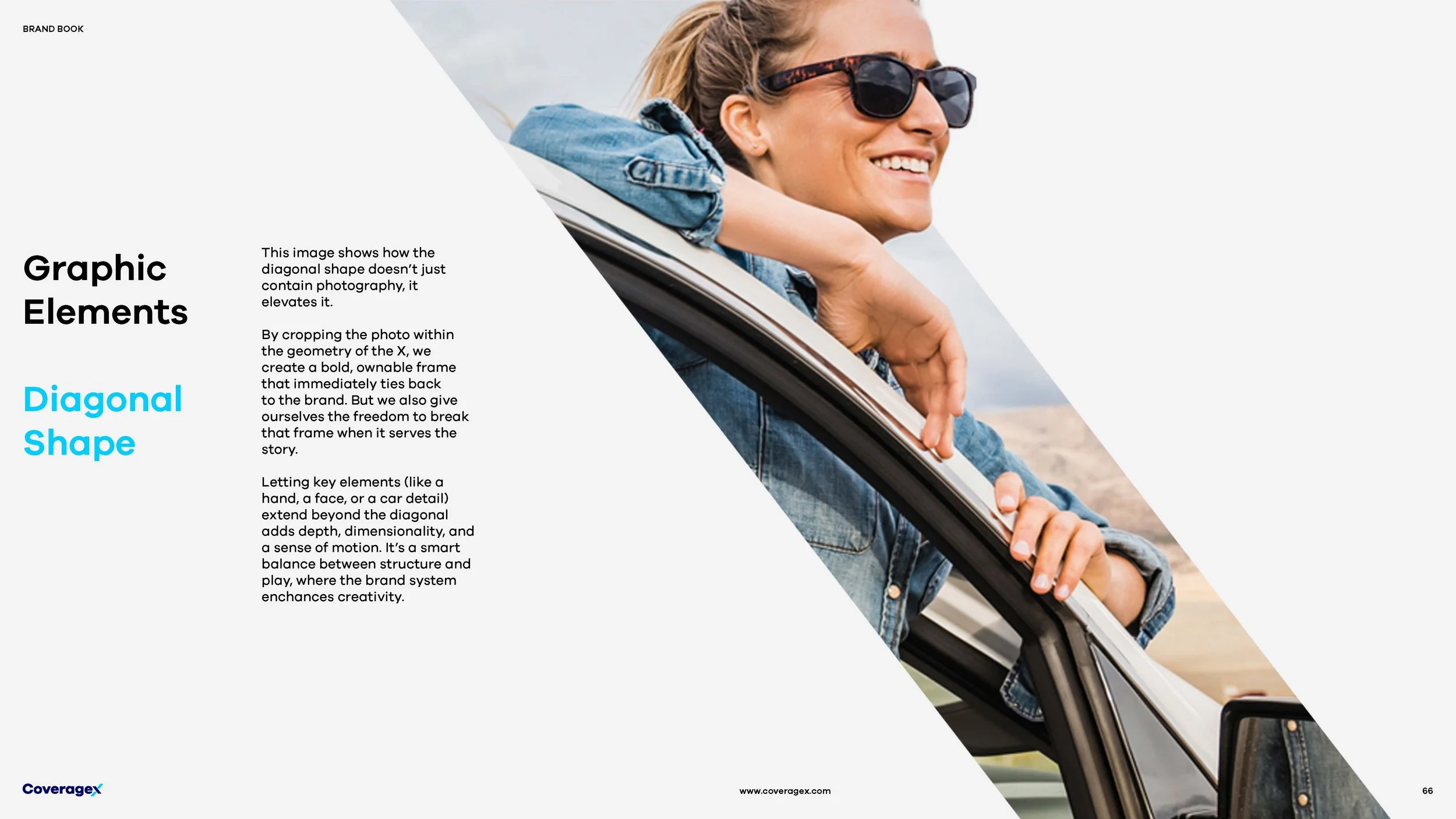
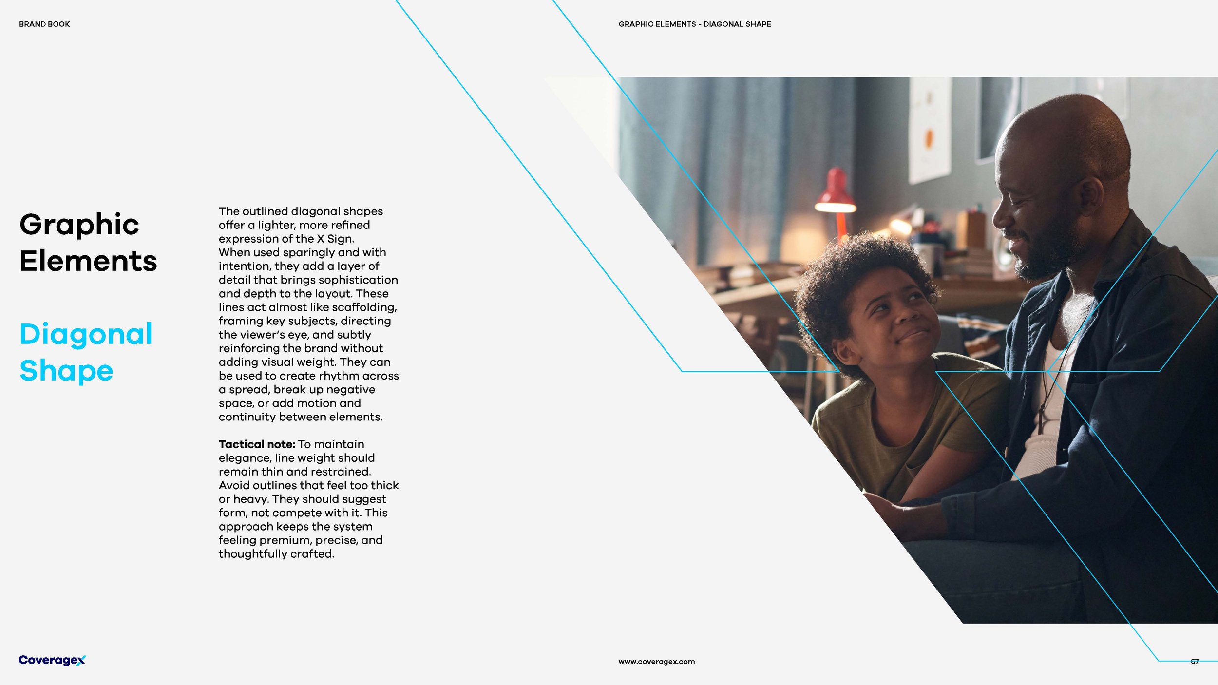
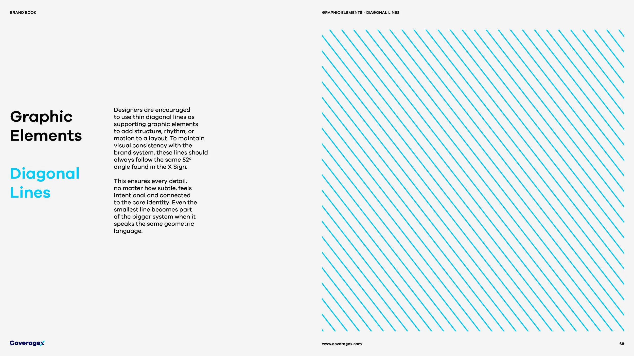
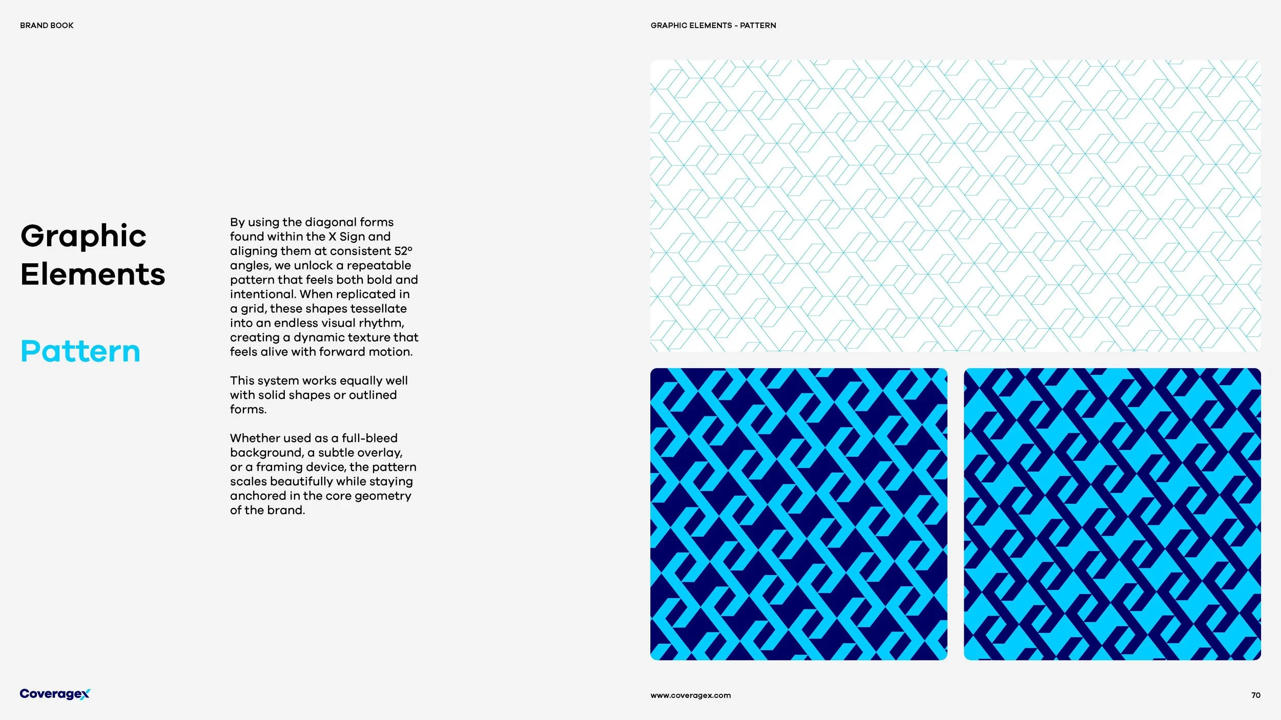
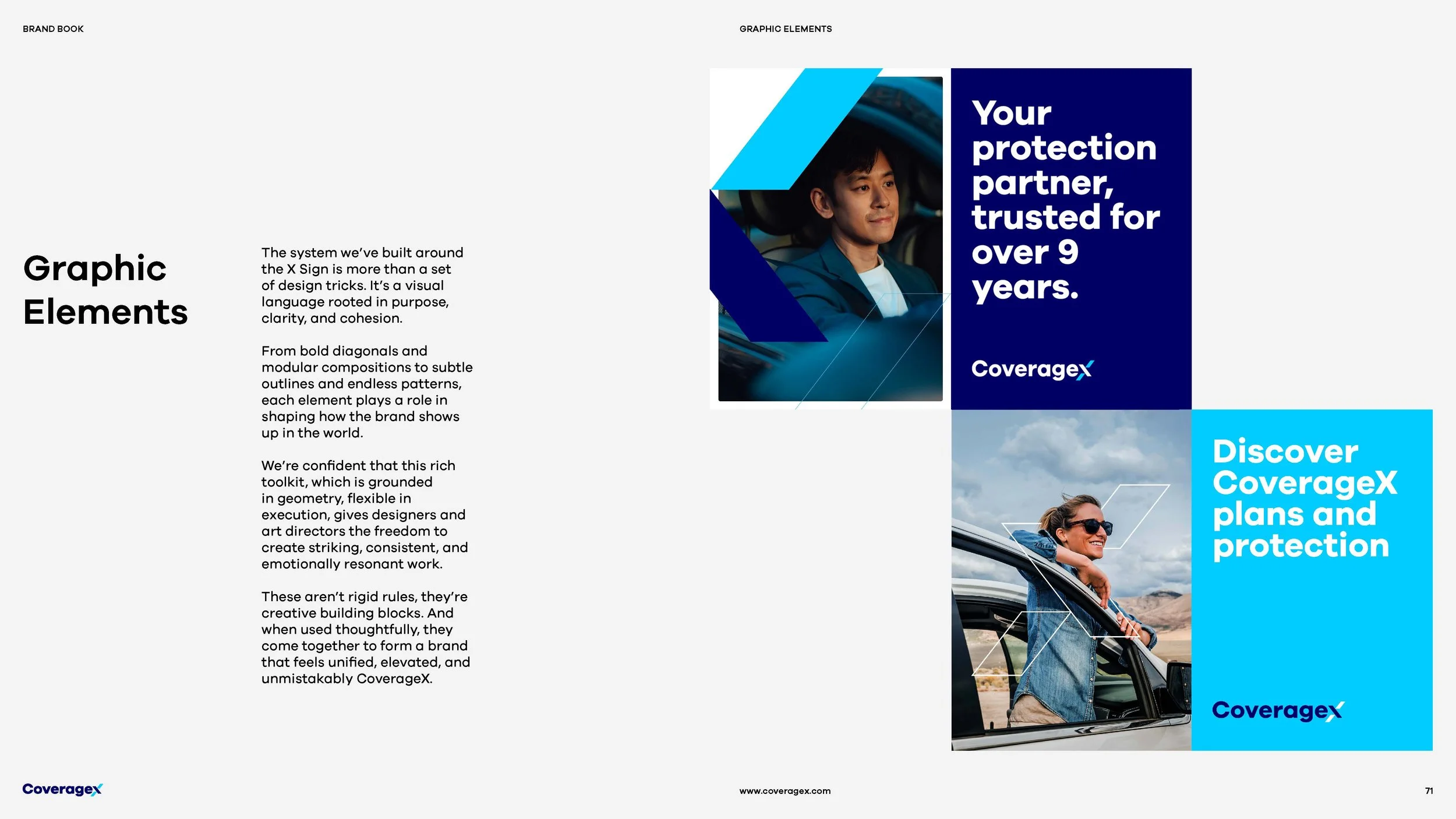
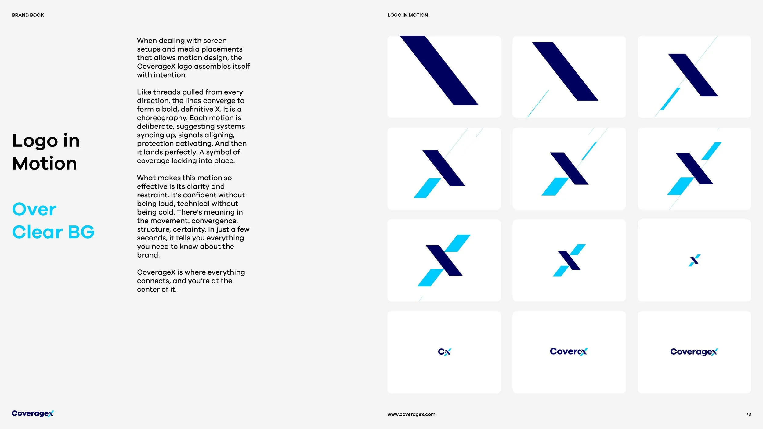
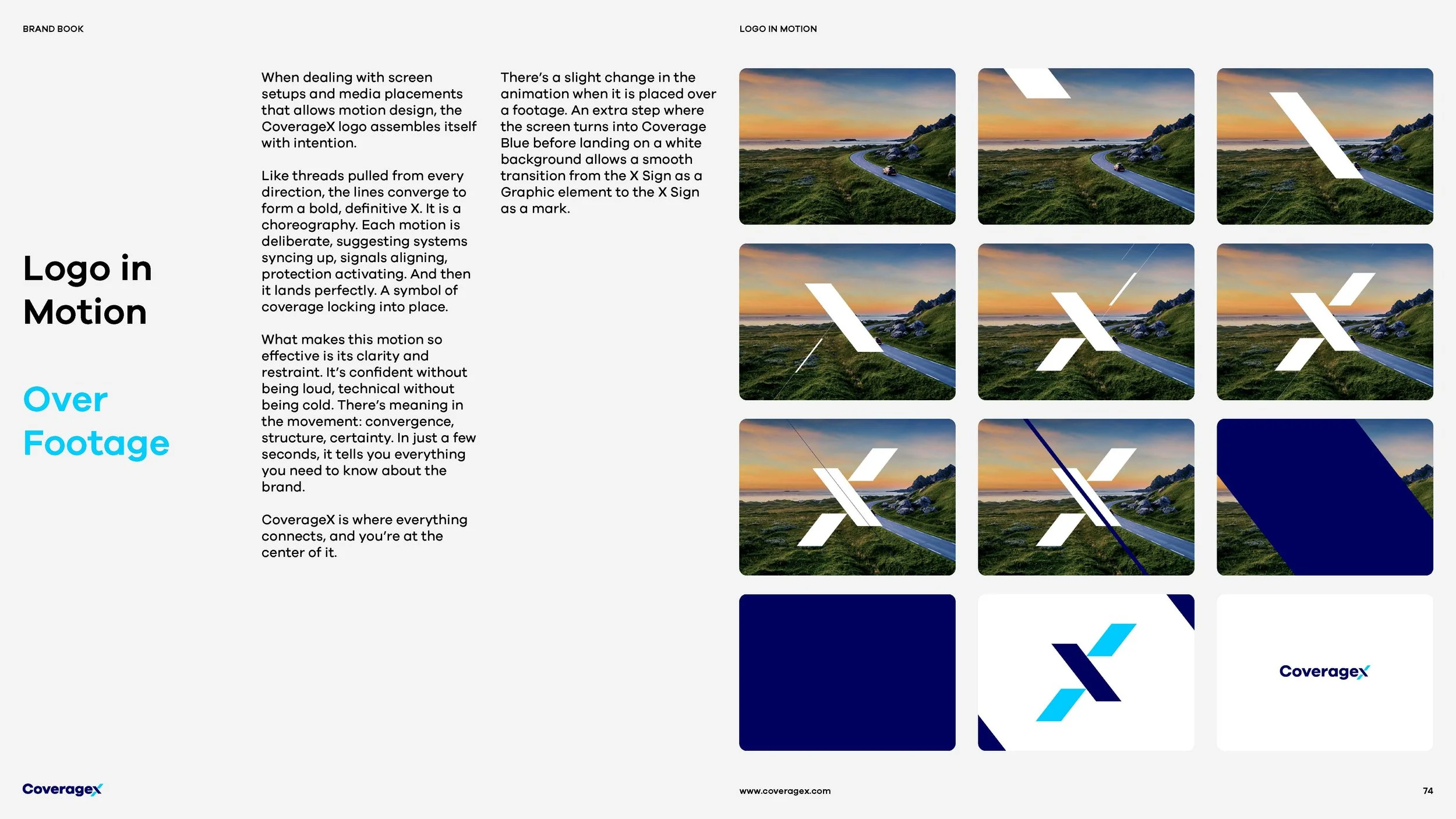
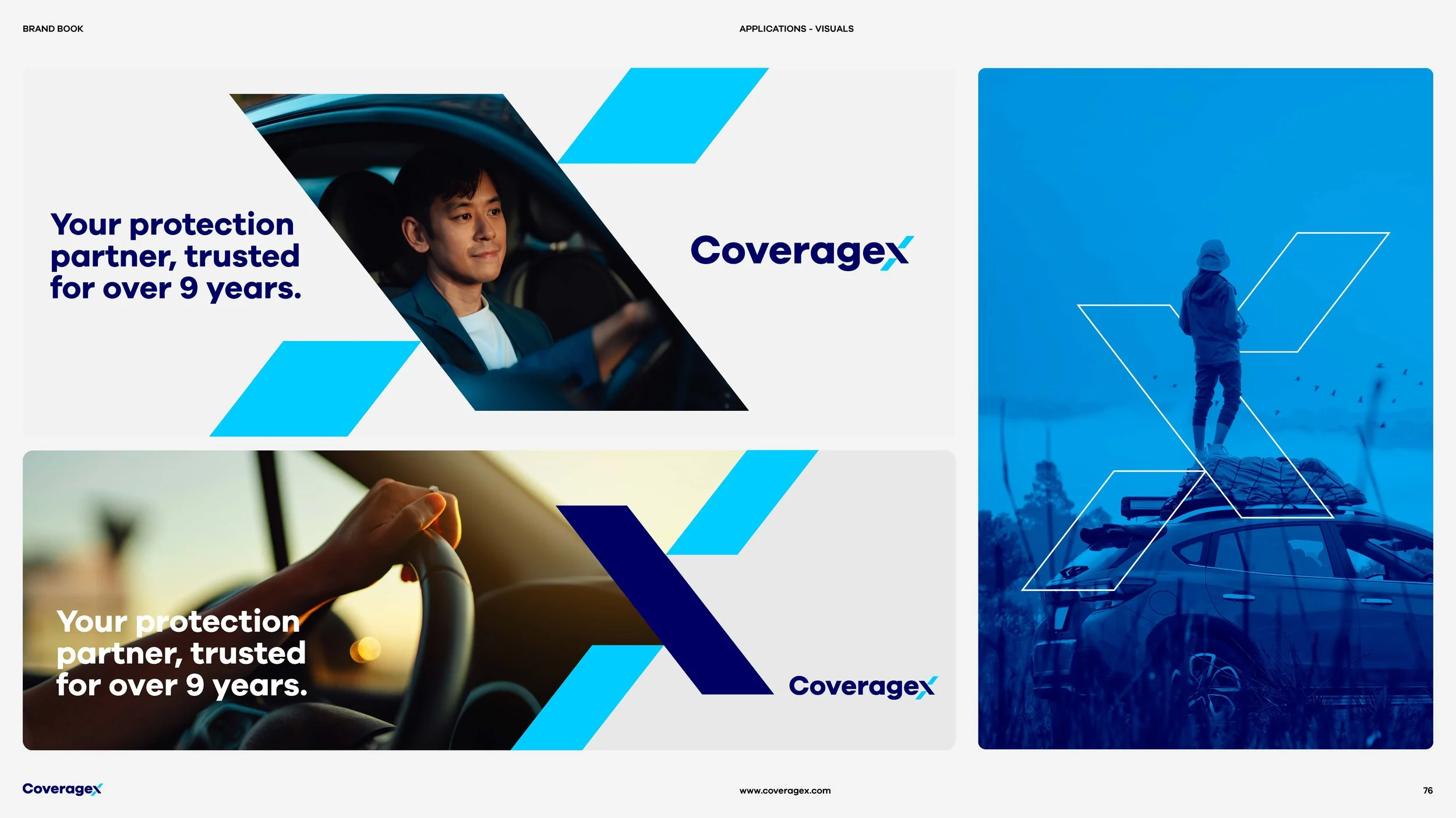
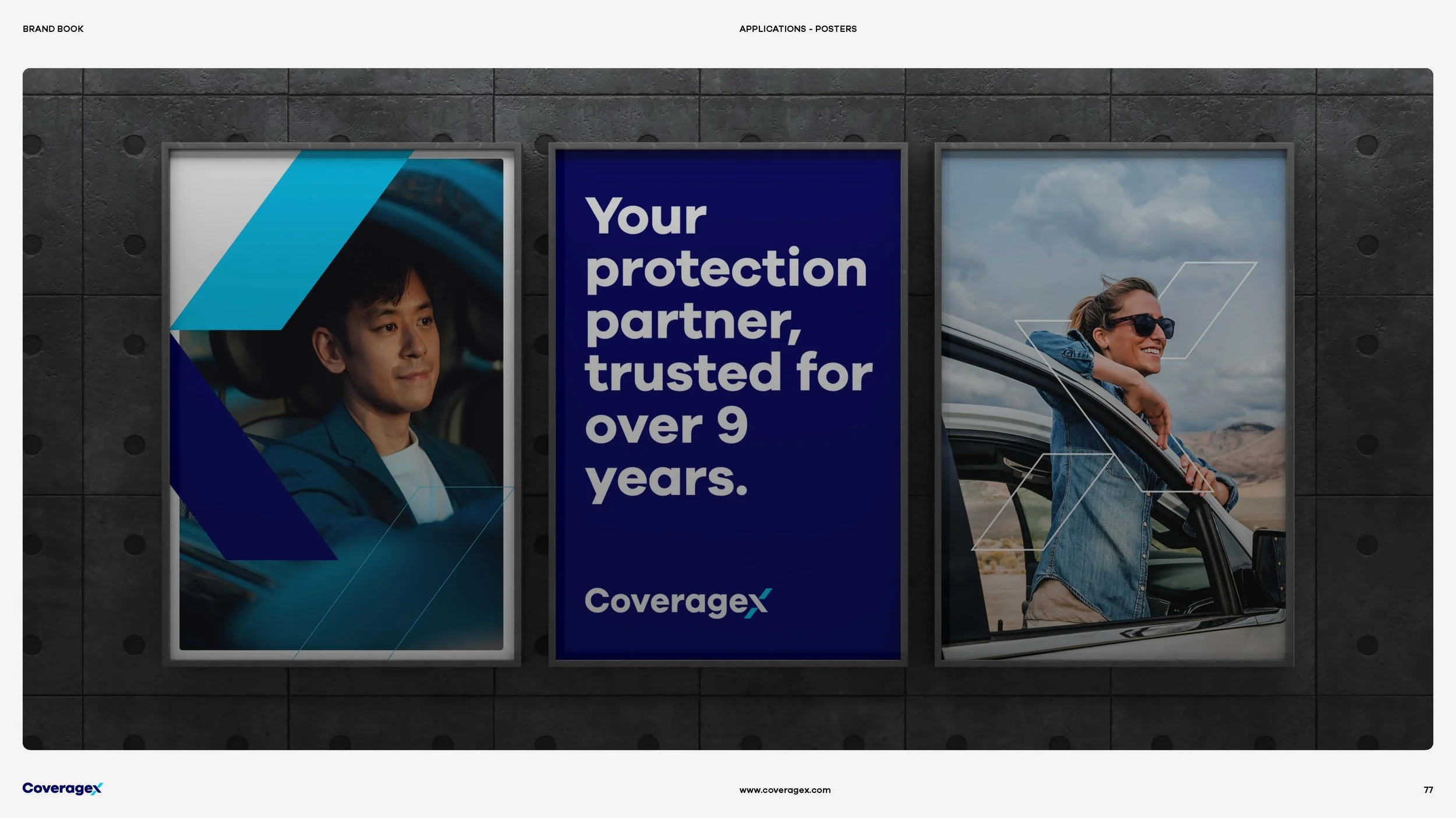
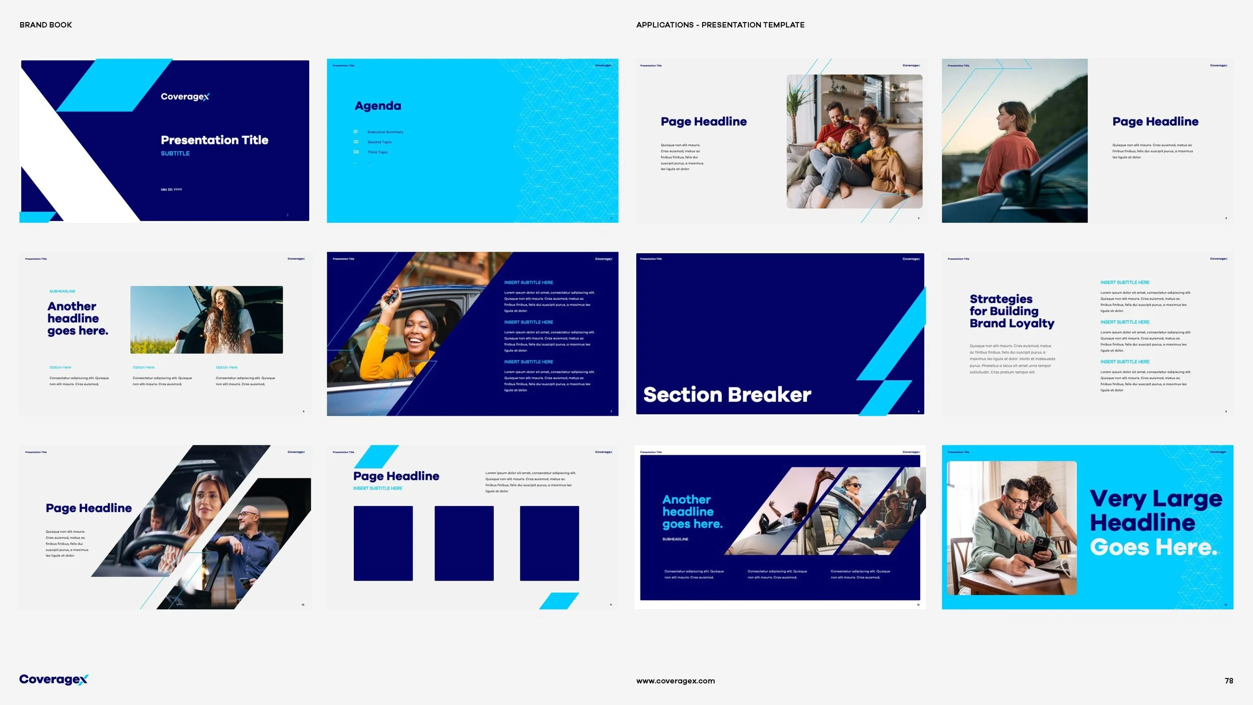
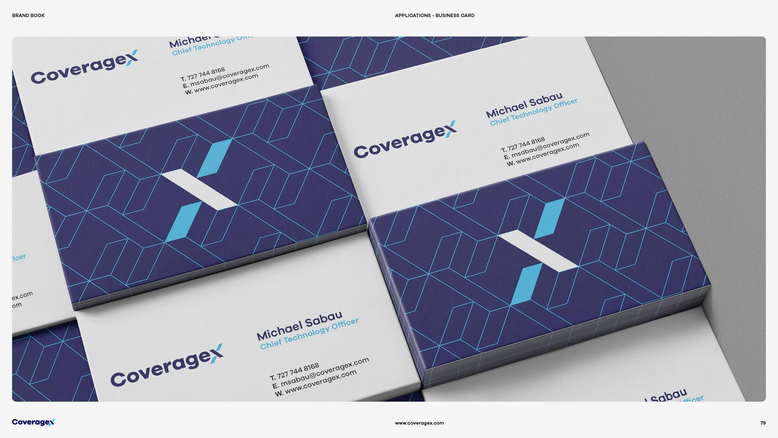
But the ambition went far beyond creating a recognizable mark. I transformed the X into the foundation of an entire visual system, using its geometry to inform compositions, graphic elements, photography treatments, patterns, and motion. Every element was designed to work together, creating a cohesive yet flexible identity that could adapt across digital, print, and real-world applications. The result was an 80-page brand book that established a comprehensive design language, balancing clear guidelines with the creative freedom needed for the brand to grow and evolve.
Brand Book
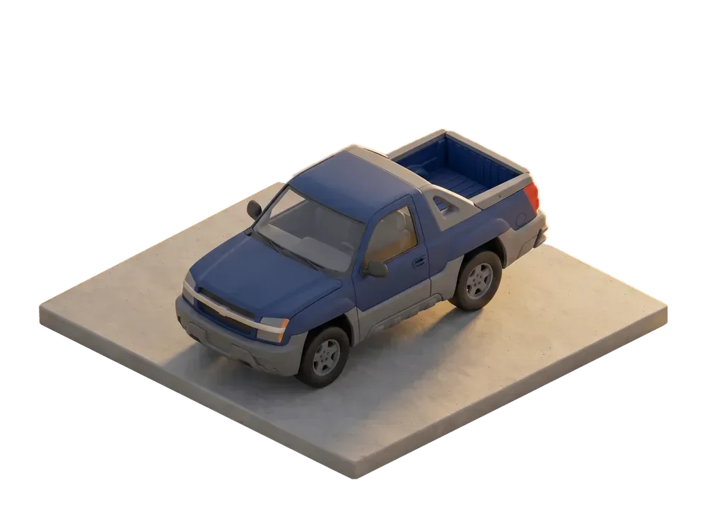
Illustrations