Visa
Brand Identity & Visual Systems
For Visa, this changing landscape creates a clear need to evolve how the brand appears across an expanding range of physical, digital and emerging experiences.
Our refreshed Brand Identity is a response to that reality.
This is a refresh, not a reinvention. The Visa name, logo, purpose, and values aren’t changing, but the typography, imagery, illustration, motion and digital design that bring them to life are evolving.
Together, these elements create a more flexible and connected expression of the brand across digital products, marketing, partnerships, sponsorships, and emerging forms of commerce.
The goal is simple: Wherever the world of commerce moves next, Visa should remain familiar and recognizable.
Brand Mark
Color Palette
Typography
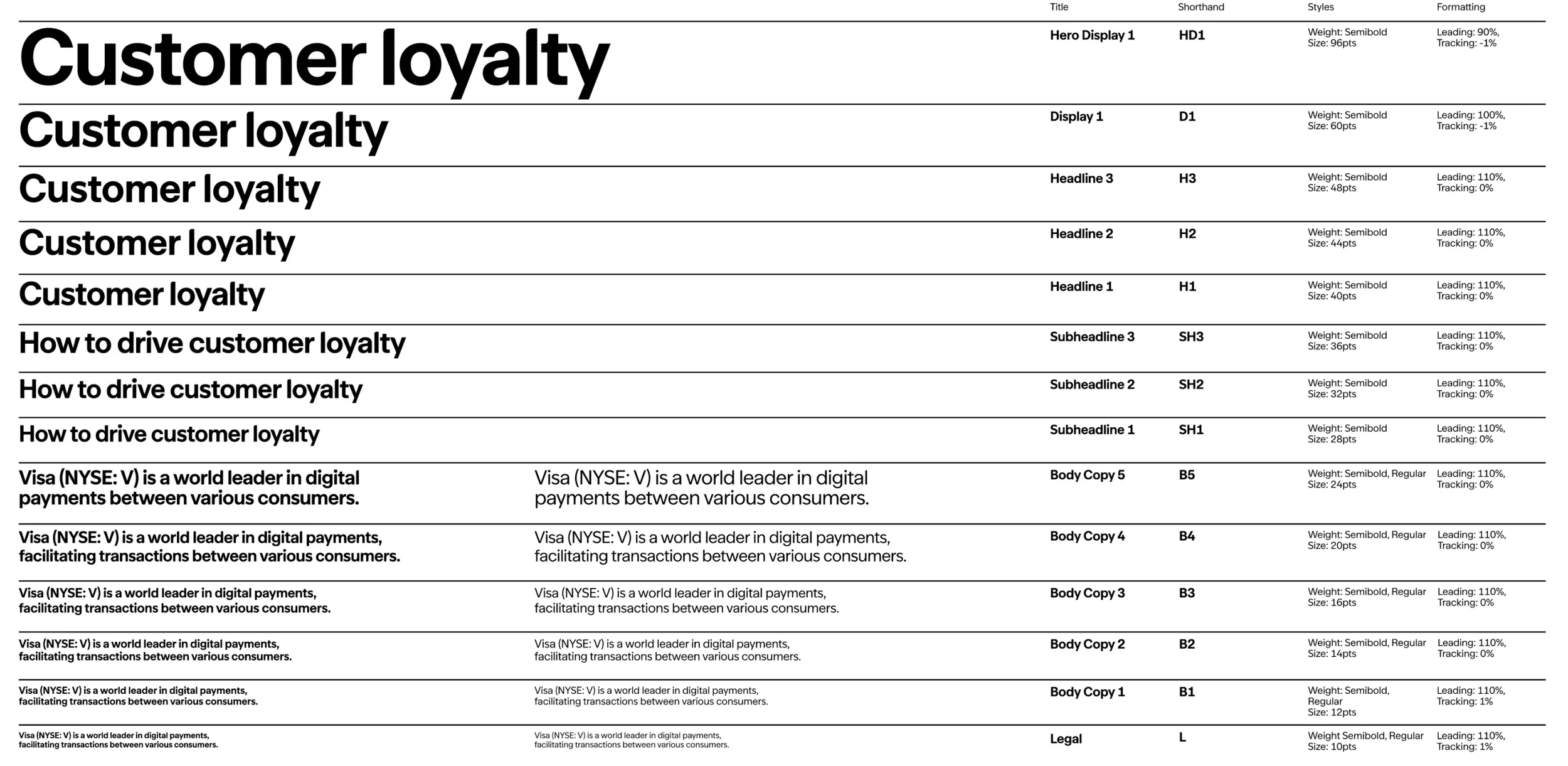
This chapter defines Typography for Visa
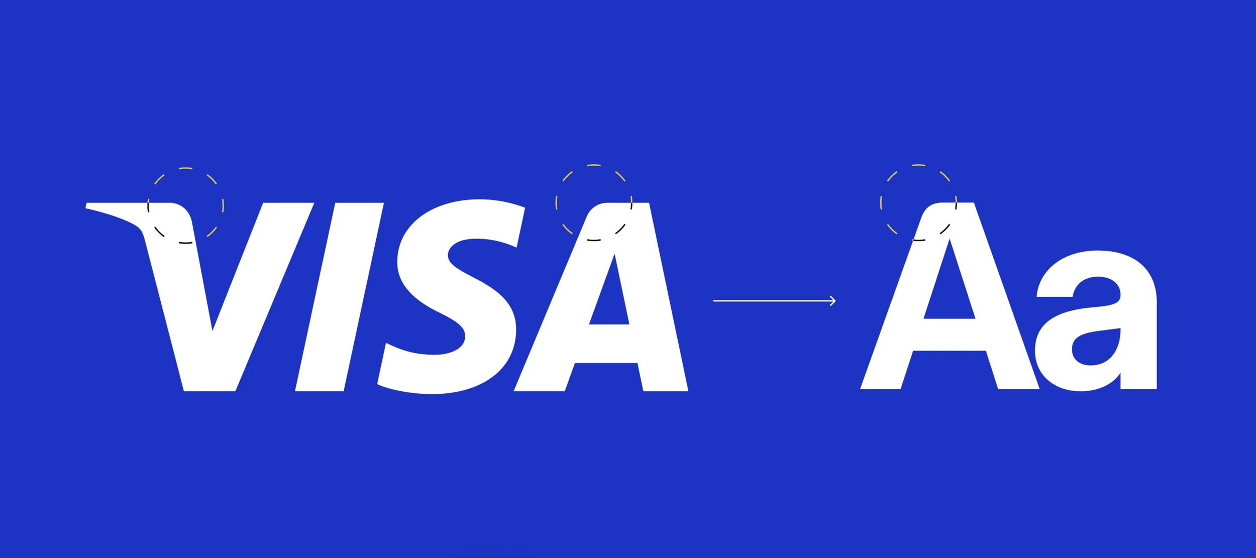
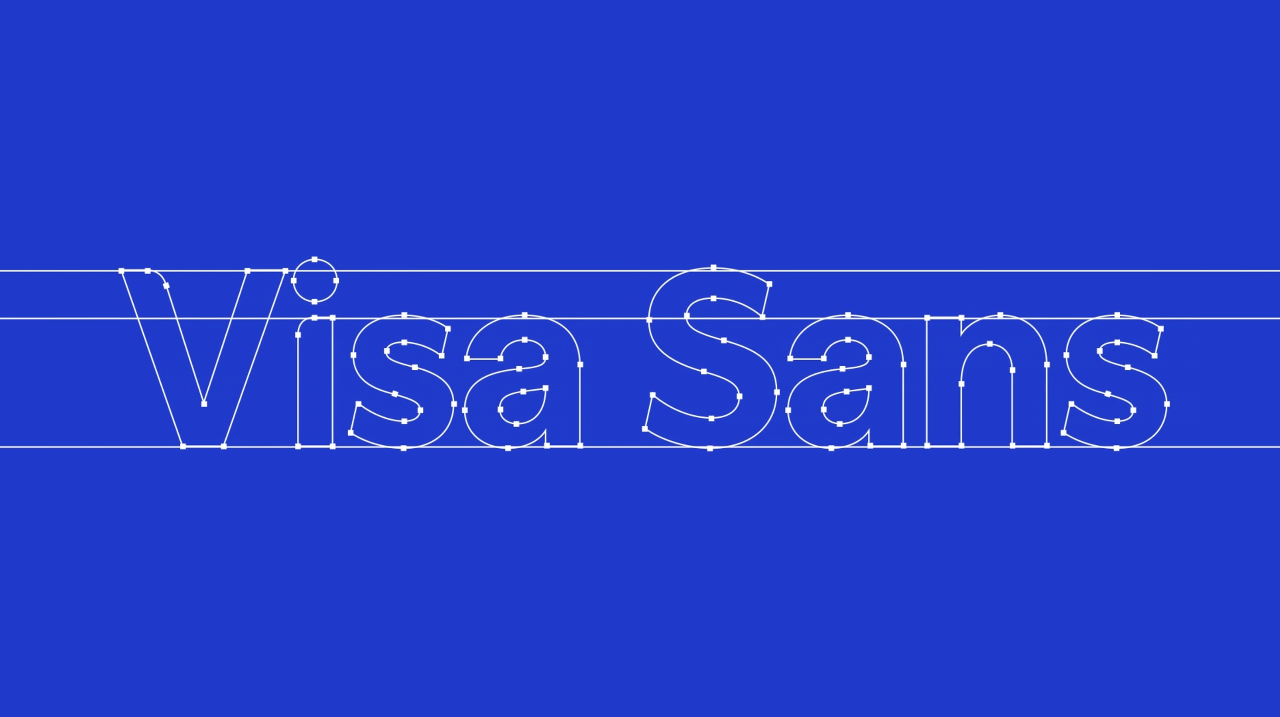
Building on the iconicity of our recognizable Visa Brand Mark, Visa Sans carries the same core characteristics into the wider type system. Rooted in the idea of driving progress with everything we do, thoughtfully placed curved corners (derived from our Visa Brand Mark) imply forward motion, setting the tone for every composition: bold but personable, simple but powerful.
Photography

Our typeface is directly informed by the Visa logo, allowing the type system to build on the brand’s existing equity and heritage rather than compete with it.

Primary


Secondary
Tertiary